BT brand refresh
Unleashing the energy of the BT brand
Client
BT
Roles
Creative Designer
Brand Manager
The re-brand
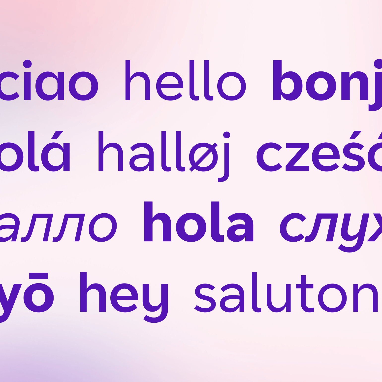
The BT re-brand launched in September 2019. The whole process was done at pace, from brief to launch was completed in a little over 3 months. I was a key part of the internal team that delivered this, working hand in hand with our branding agency Zag through the entire process. The rebrand introduced a new logo, typeface, hero asset (The Portal) and a refined Indigo, building on the purple brand colour BT was known for.
Stepping back and assessing
After using the brand for 12 months, parts of the original vision didn't come to life as expected. The energy of the brand didn't come across, it often felt heavy with the core colour of indigo, and there needed to be more flex when speaking to Business customers.
The brand refresh project allowed the team to re-develop the brand on a larger scale, building on the ad-hoc refinements made since launch.

Bringing energy to the brand
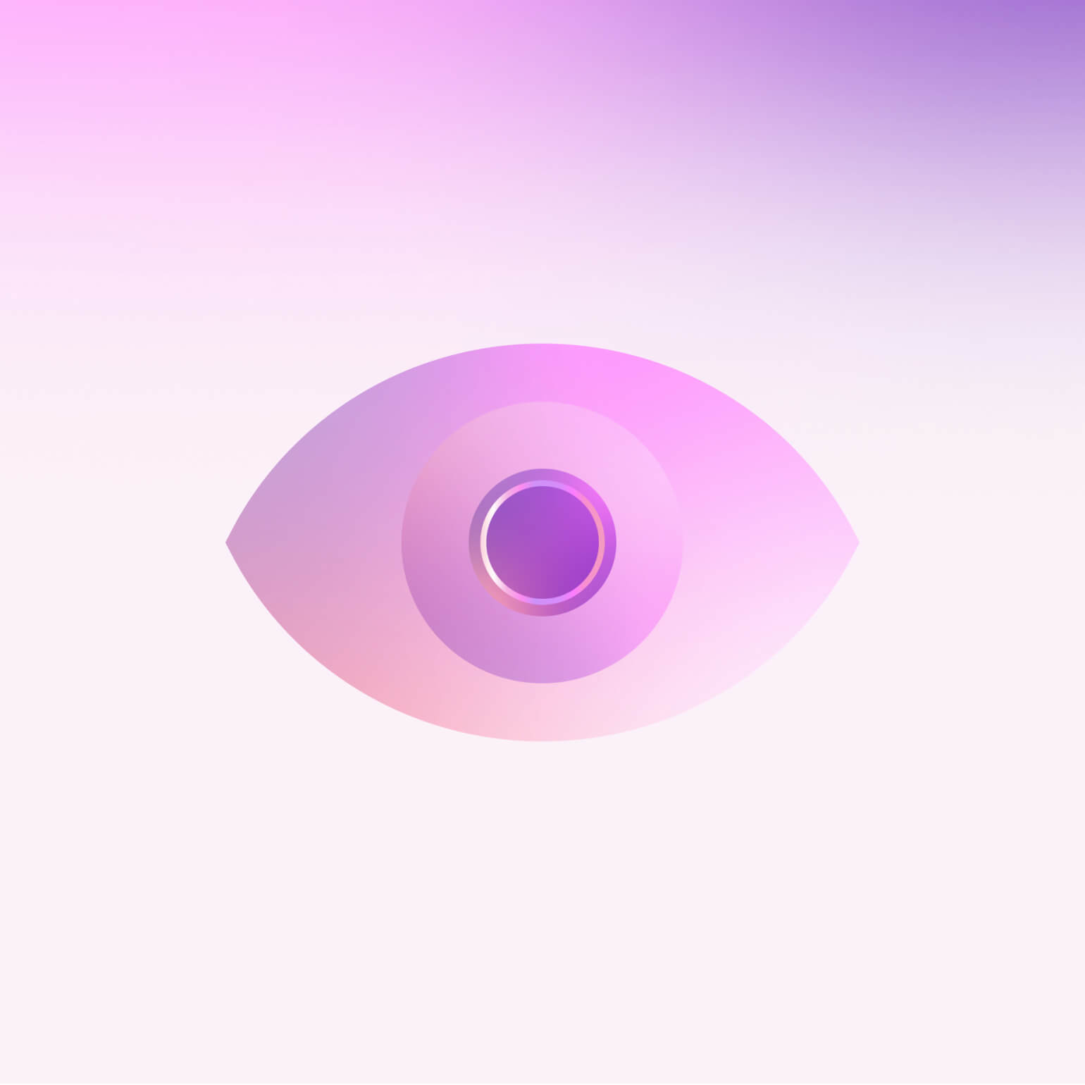
To ease the reliance on Indigo that had dominated two new worlds were introduced, full colour and light. This allowed the identity to flex across different creatives, and The Portal was re-developed to embrace this flexibility.
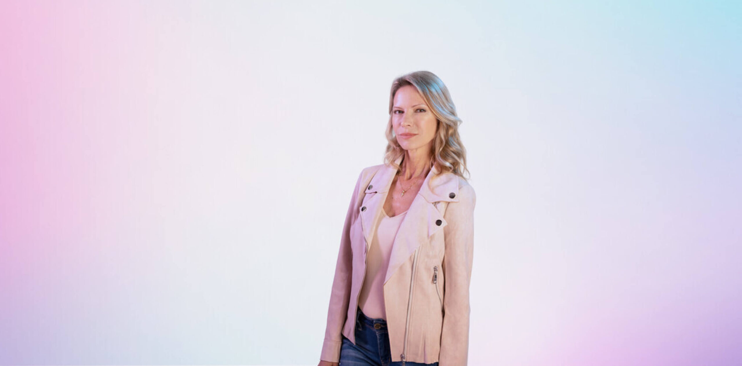
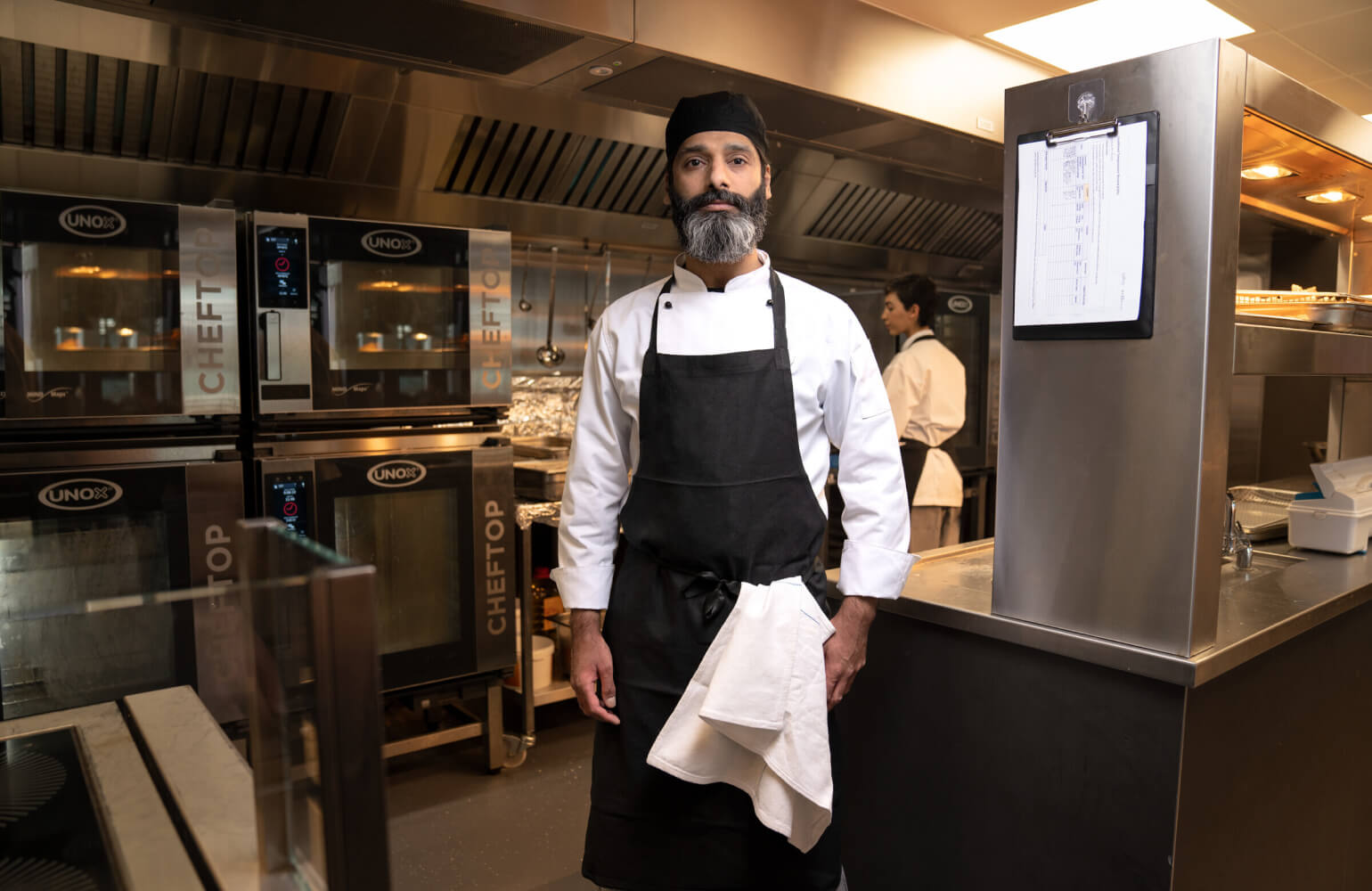
Illustration styles were refined to better show products without a physical presence. The photography style was enhanced, embracing the people using the products and services. And all the bits that worked already, like the logo and typeface, stayed the same.