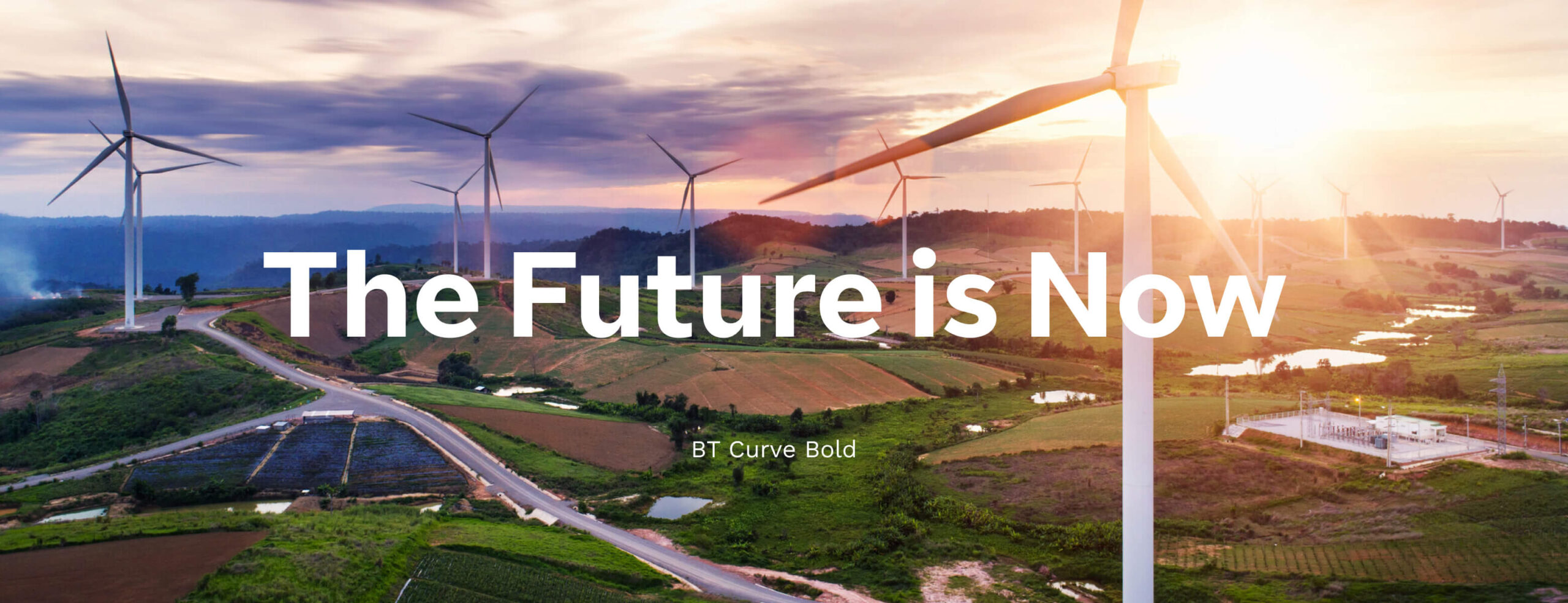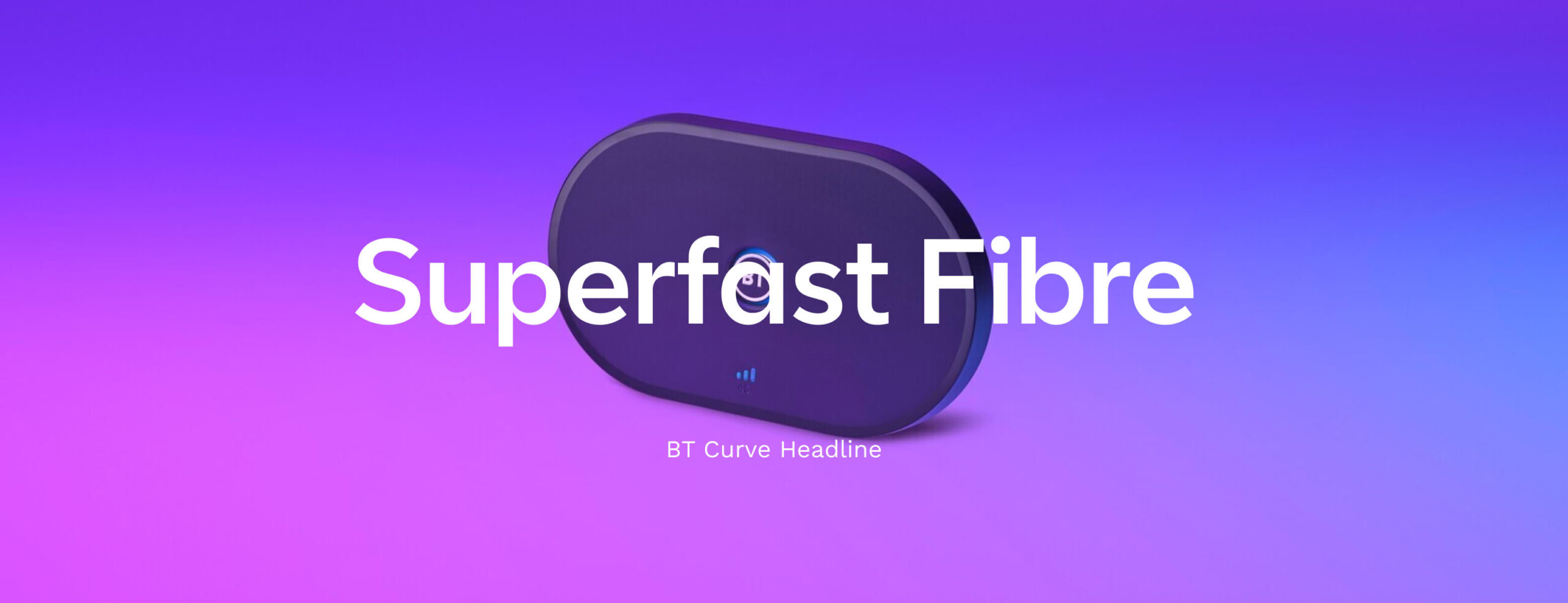
BT Curve
An ownable, robust and dynamic typeface for BT.
I led the work from the BT side, helping to shape the brief and the typeface with the font foundry Dalton Maag and our branding agency, Zag.
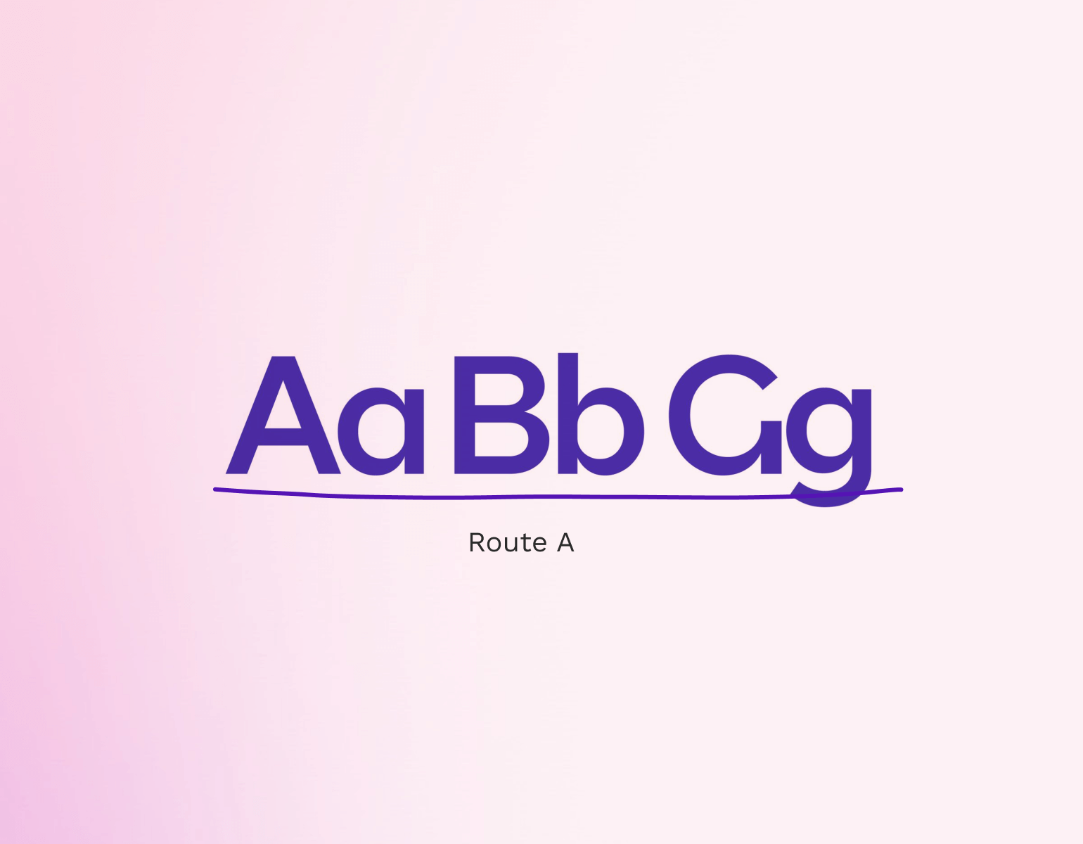
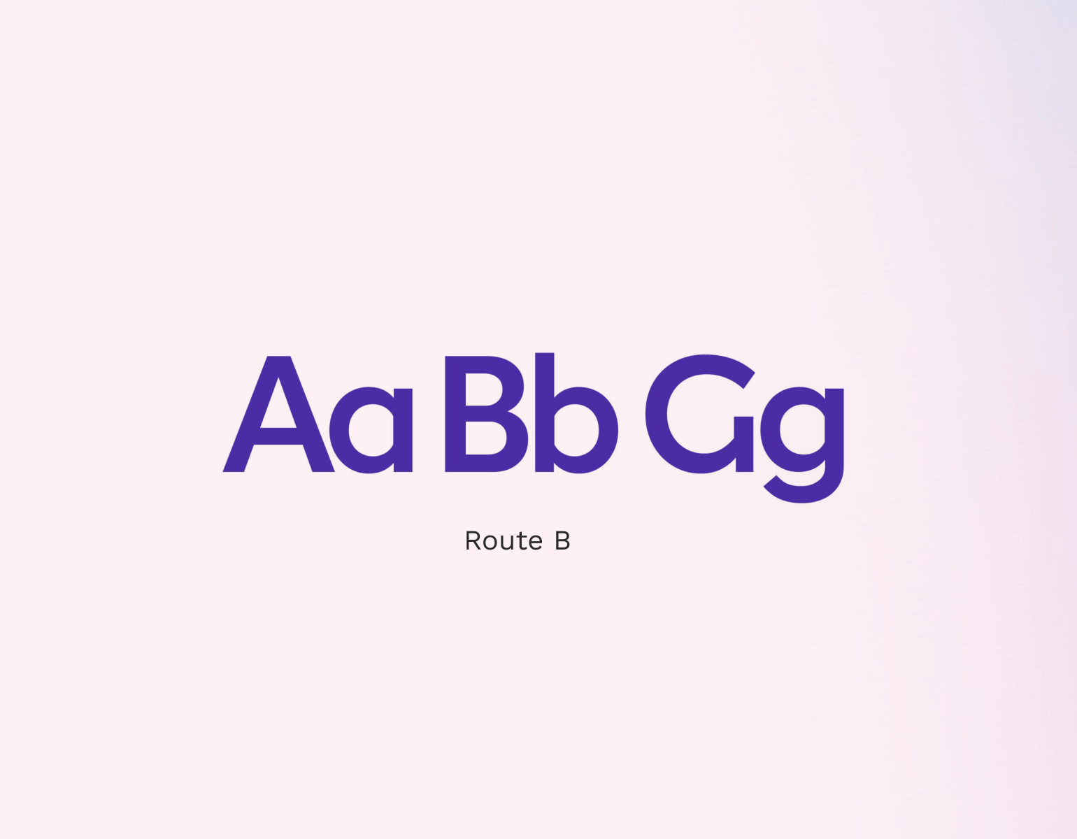
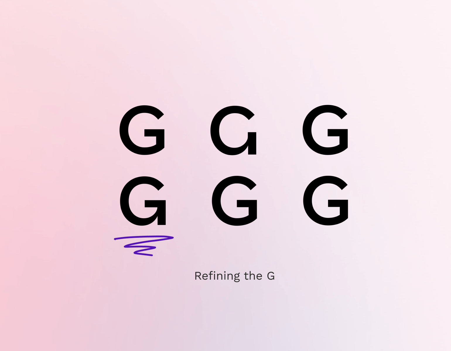
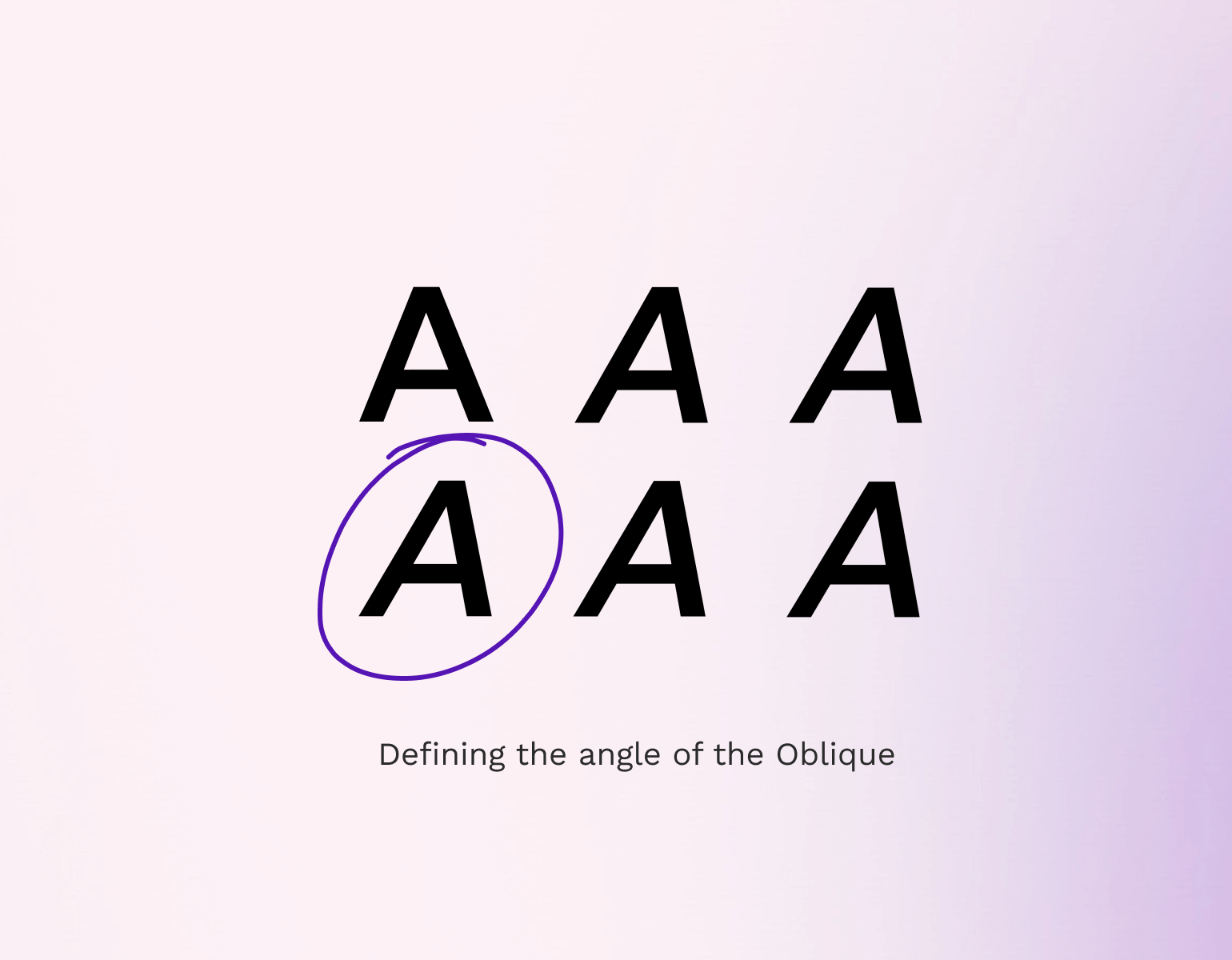
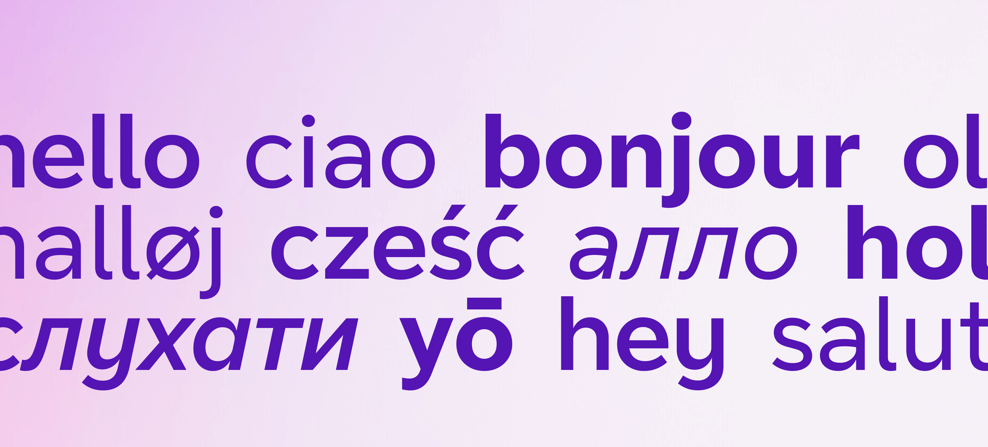
From the initial concepts, the typeface was refined until it paired perfectly with the new visual identity. We worked through each character, refining bowls, counters, tails, spines, terminals and strokes. Checkpoints with the team and business allowed us to assure the typeface was usable, accessible and legible while still feeling part of the BT brand.
The final typeface was delivered in multiple weights, widths and styles. Supporting both Latin and Cyrillic characters.
Client
BT
Roles
Creative Direction
Brand Lead