Coverage checker
Making connectivity clearer
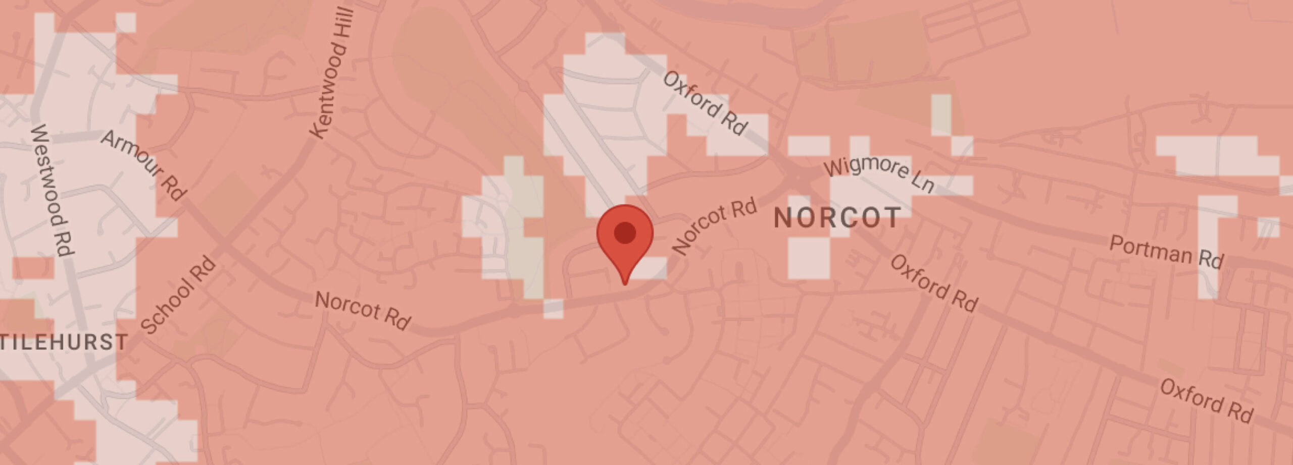
Explaining mobile network coverage presents challenges, with maps often falling short in conveying the true user experience and aren’t great for accessibility. When Three launched its 4G network, our agile team seized the opportunity to enhance the user experience.
Client
Three
Roles
Visual design
UX
Research
To better understand user behaviour, we conducted workshops with both customers and non-customers. Feedback revealed issues with the existing coverage checker, such as the map's lack of clarity, the map using too much screen real estate on mobile, confusion from multiple colours, and users' difficulty understanding the connection between the map and their signal.
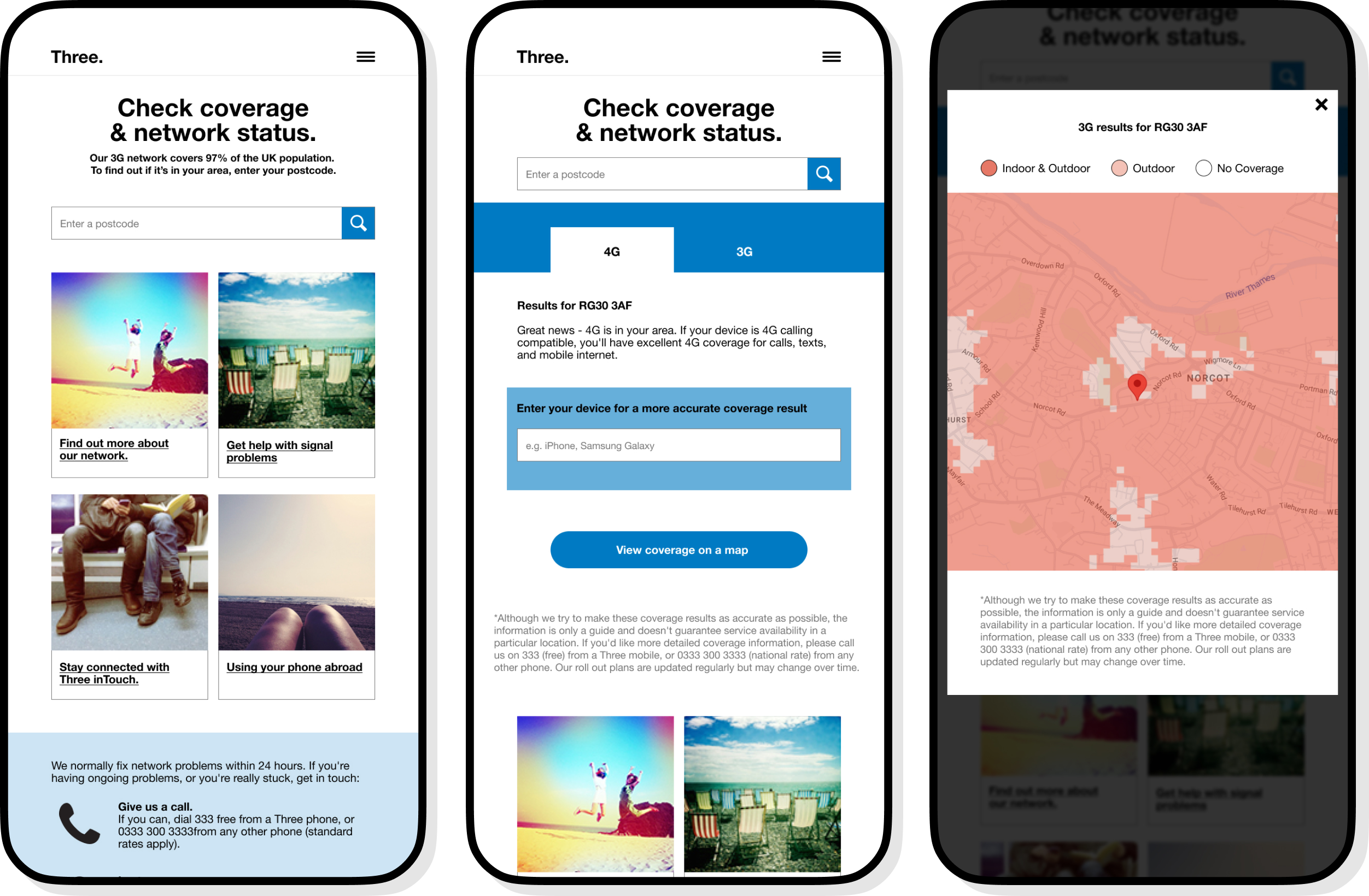
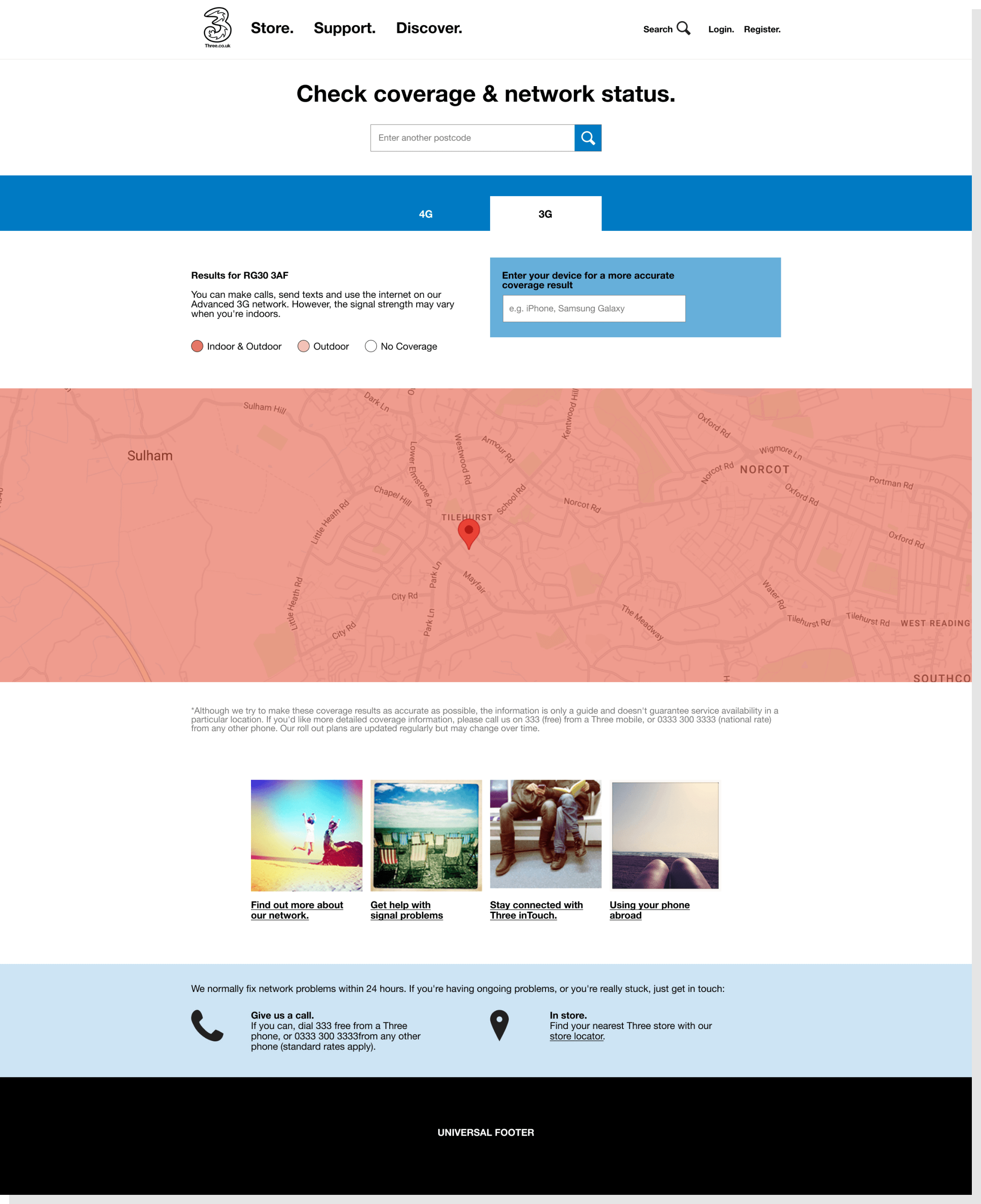
Using these insights, we redesigned the interface leading with a mobile-first approach, prioritising written descriptions and making them more prominent. And we introduced information to help users understand how their devices might impact their network. The map was used to support this rather than the primary source of information.

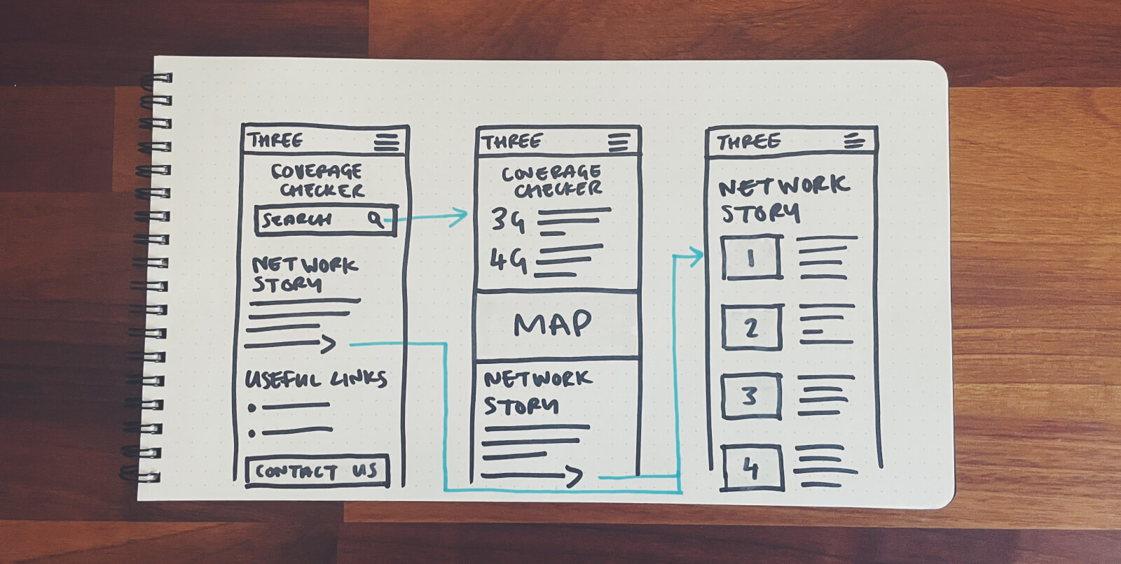
Testing was crucial in refining our approach. Basic wireframes were created from our sketches and tested with users, resulting in further adjustments. Signal types were tabbed, with 3G set as the default to simplify information. On mobile the map was placed behind a click to avoid taking up too much real estate. We also moved supporting network messaging to a new page on to avoid distracting users from the primary purpose of the page.


01. Initial wireframe
02. Post user testing wireframe
The outcome was an informative page that clarified network expectations and notably reduced web chats initiated due to confusion. The process yielded a more streamlined and user-friendly experience in navigating mobile network coverage.

