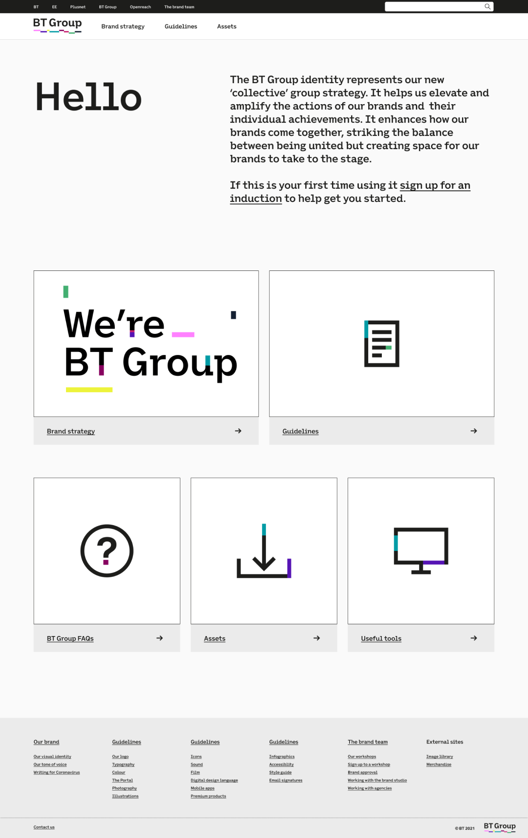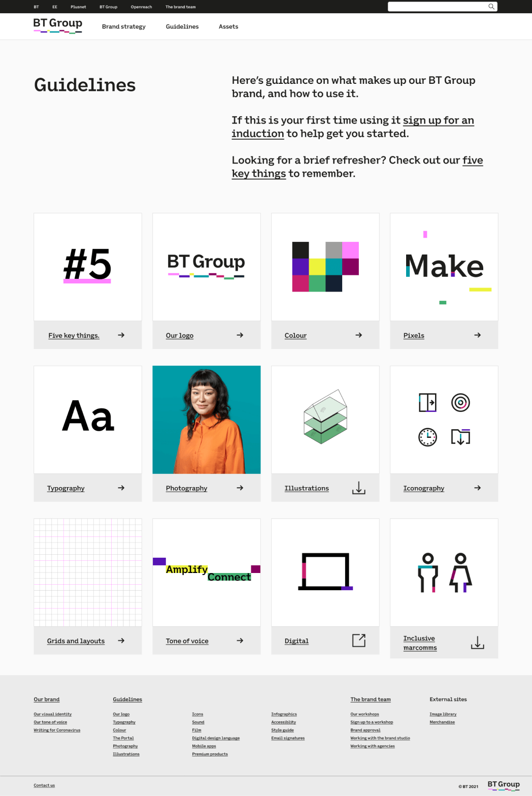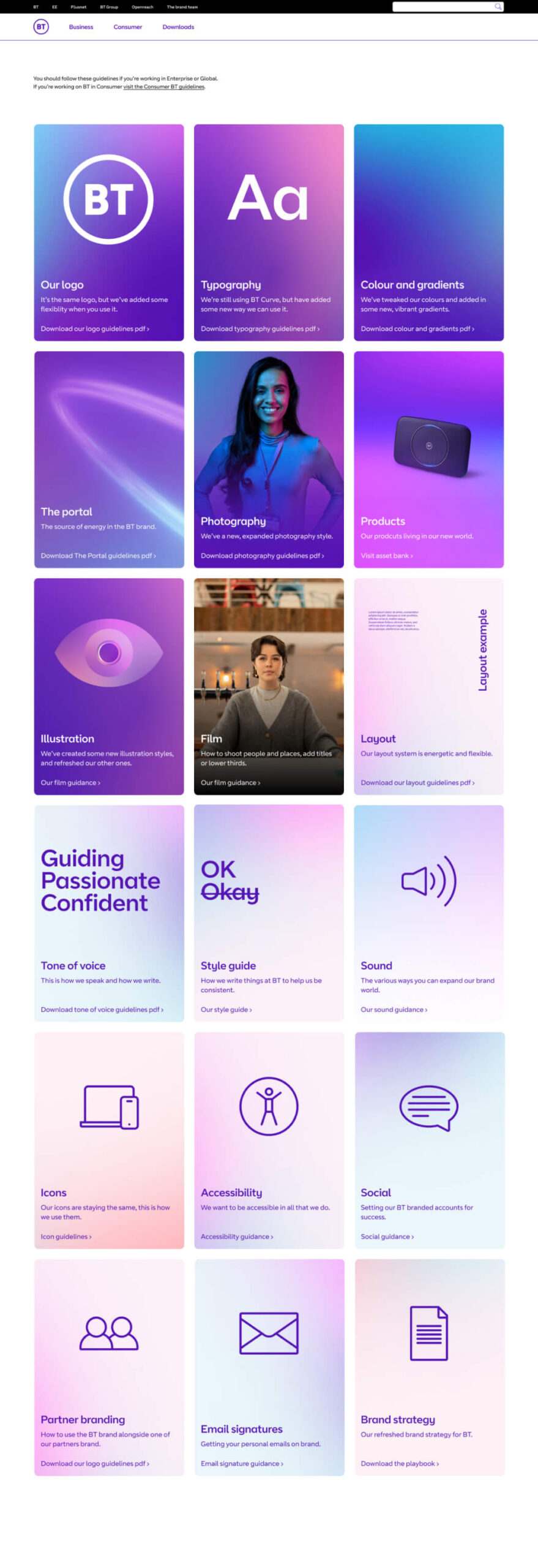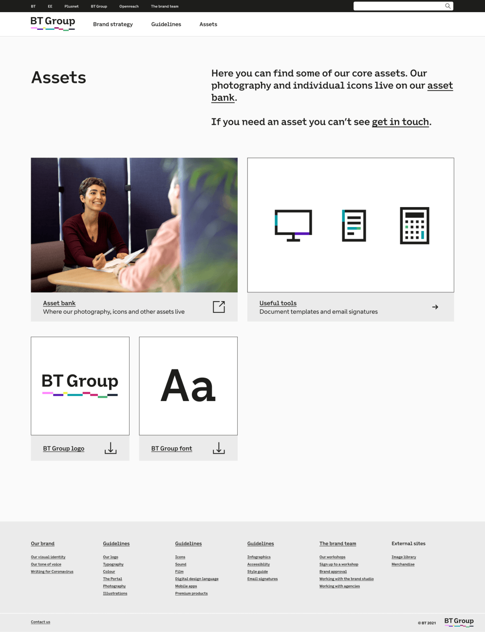
BT Group brand site
A single source of truth
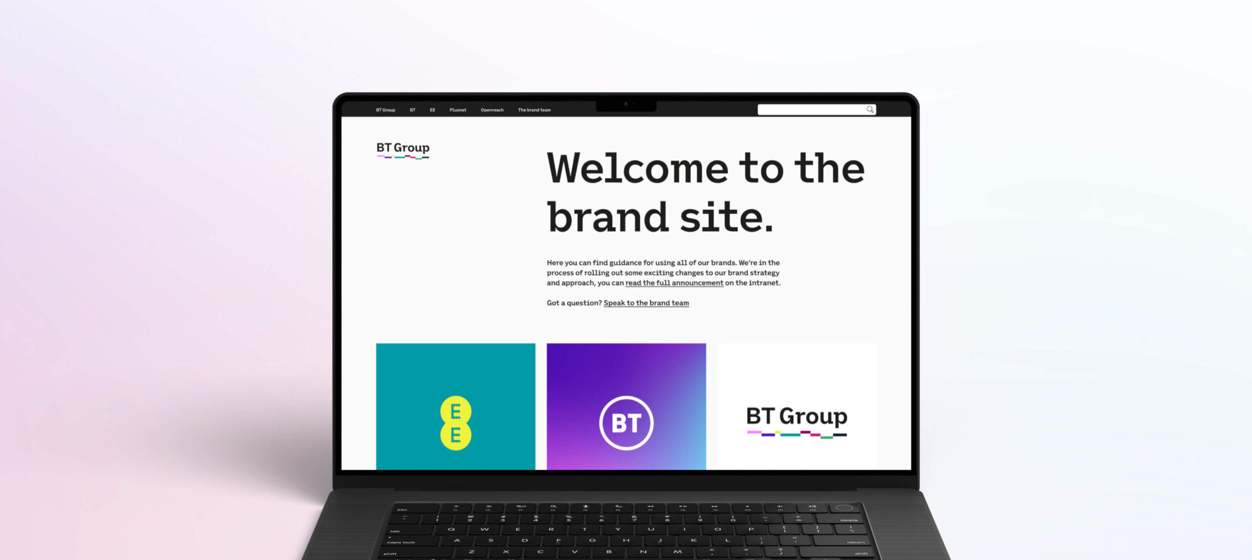
BT Group lived in a world where it important guidelines were locked away in static, uninspiring PDFs, fostering a 'download once and forget' mentality. Updates went unnoticed often, leaving teams relying on outdated guidance and assets. A recipe for confusion and missed opportunities. It was time for a change. The Solution? A dynamic digital hub crafted to encompass all things brand-related across BT Group. A single source of truth.
Client
BT Group
Roles
Product owner
Creative Lead
UI Designer
Content Designer
Site builder
Research, research and more research
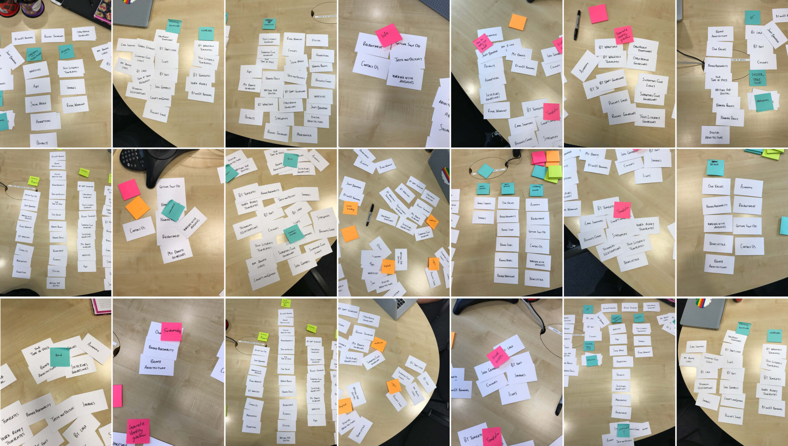
We were creating a site that didn’t exist, and brand guidelines serve a diverse audience, each with distinct needs. Understanding these nuances was essential in creating a site for all. Through engaging user interviews and immersive card-sorting sessions, we gained a deep understanding of how they interacted with the guidelines. This user research, combined with competitor analysis and the brand team's vision, helped us shape the website's direction.
A blank canvas
We started with a blank canvas. No technical infrastructure. No visual designs. And it had to cater to multiple brands, each with a unique identity. From the research a sitemap, wireframes and clickable prototype were developed. From this I created a library of adaptable components, breathing life into each brand through theme customisation. A balance between creativity and consistency. Working closely with the tech team, we ensured that every brand could shine through.
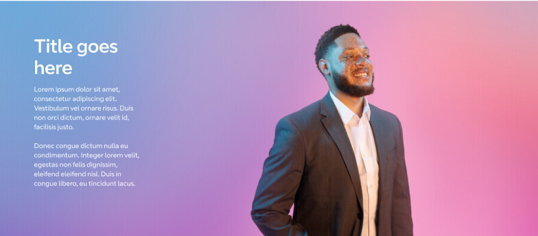

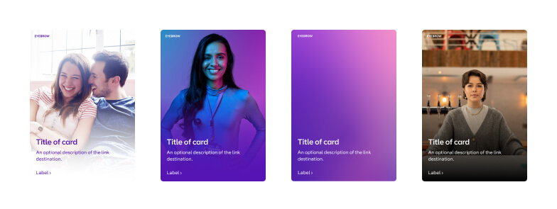


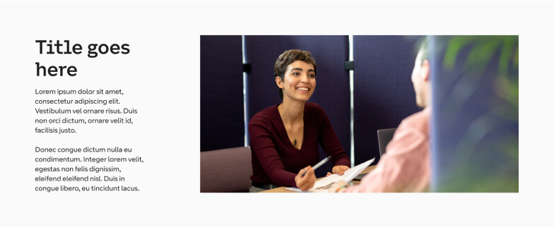

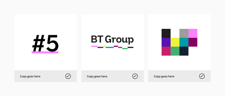


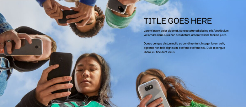

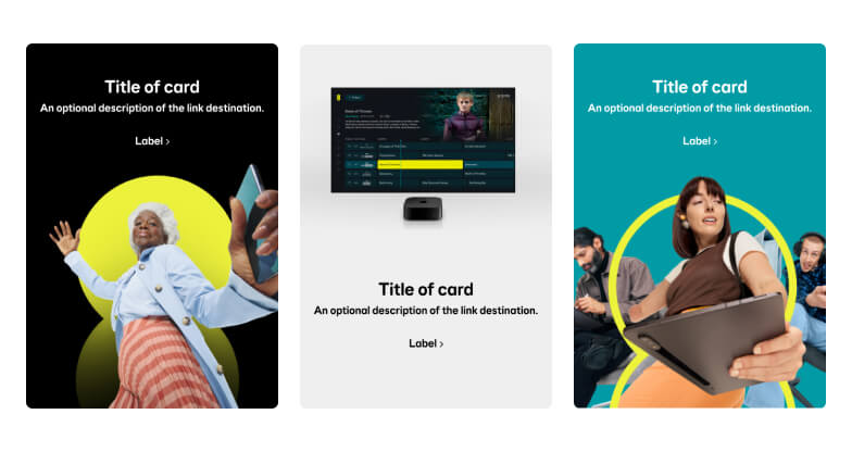


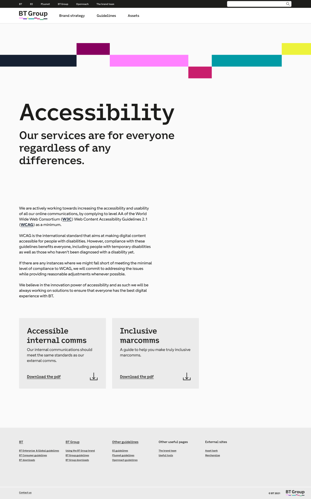
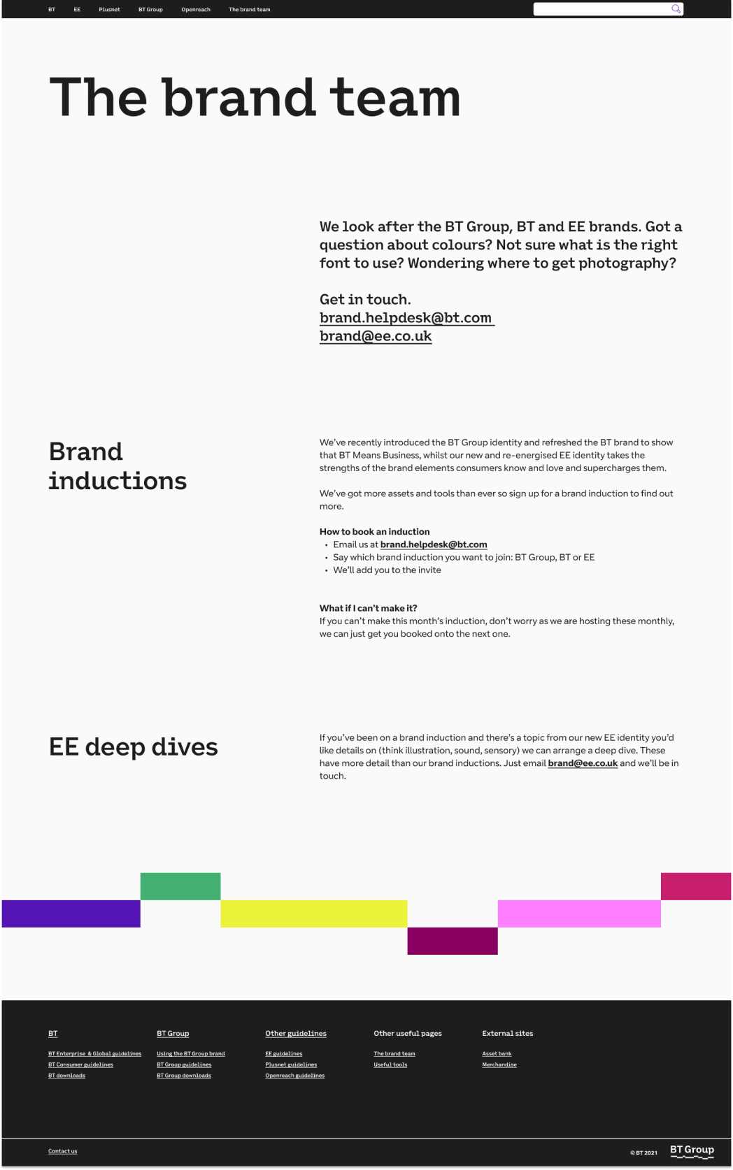
A selection of the components for each brand.
Constant improvements
A large majority of teams at BT Group need guidelines to do their jobs. So an MVP was launched to deliver them quicker and pages were added on an almost daily basis. We invited feedback from the users helping us to refine the site as we continued to design and build it. New features were added, accessibility was improved and the journeys were made clearer.
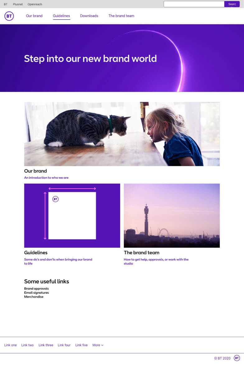
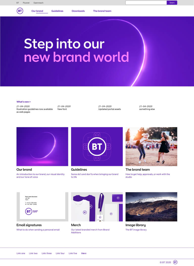
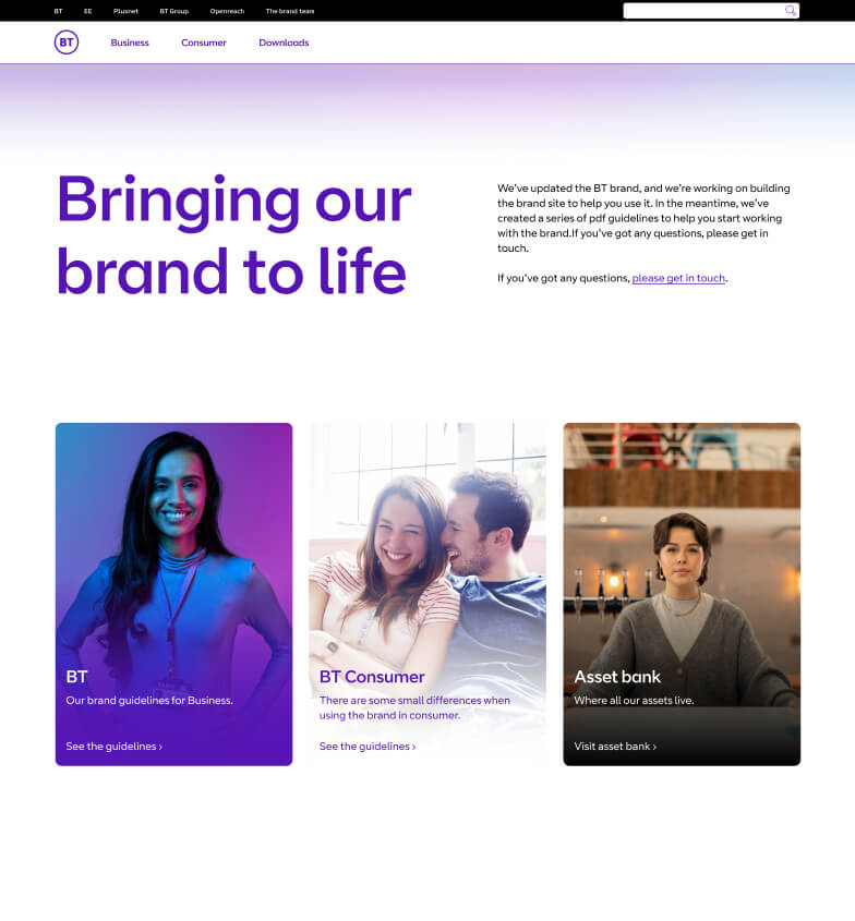
BT homepage
01.
The first homepage, designed to get guidelines into users hands quickly.
02.
Improved page hierarchy, ‘what’s new’ added to the site to track constant guideline updates.
03.
Elements common to all brands moved to their own site, clearer navigation to b2b and b2c guidelines.
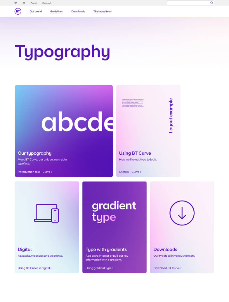
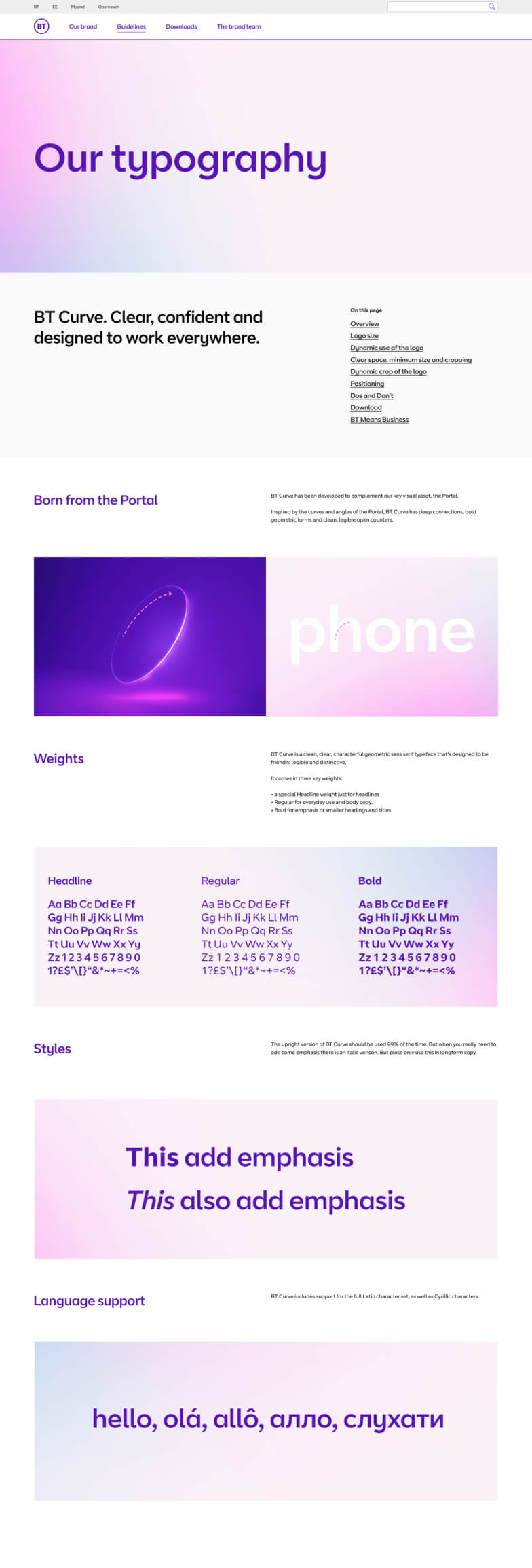
BT typography page
01.
Typography page launched with all the information on a single page.
02.
Updated content hierarchy & type hierarchy, introduction of hero image, sub pages added to split out information and add more detail.
03.
Sub pages were getting missed, new landing page introduced with clearer sing posting improving visibility of key information.


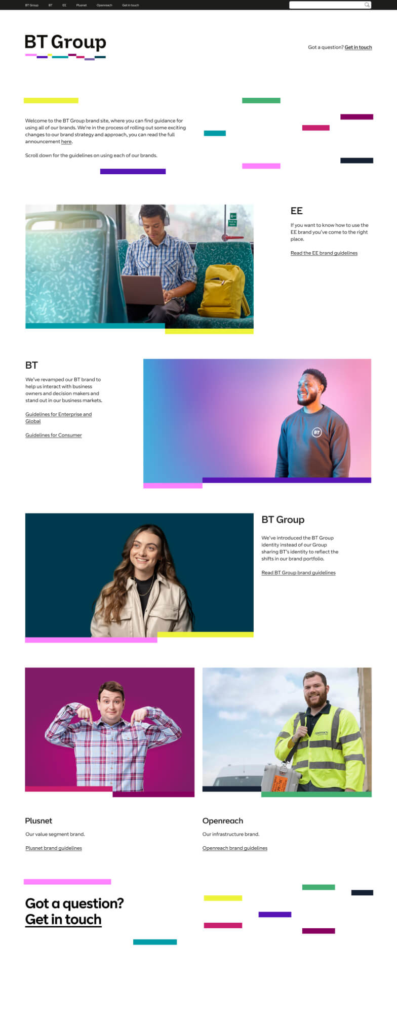
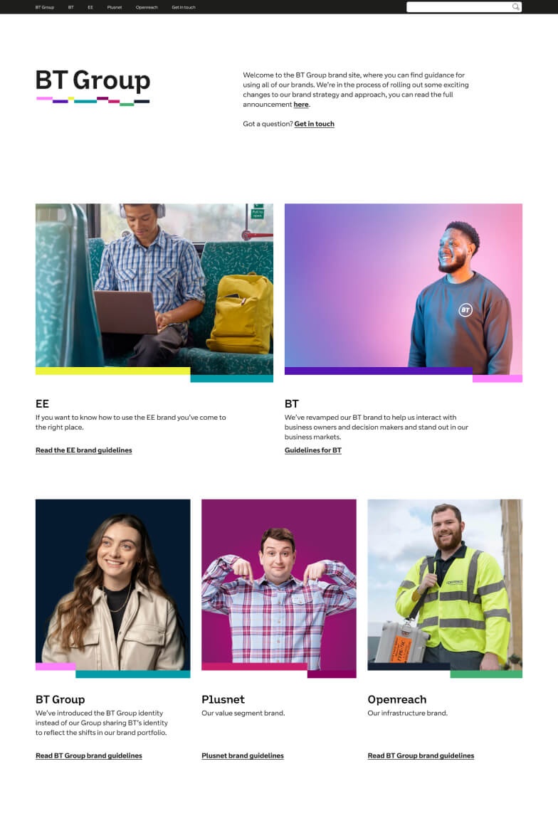
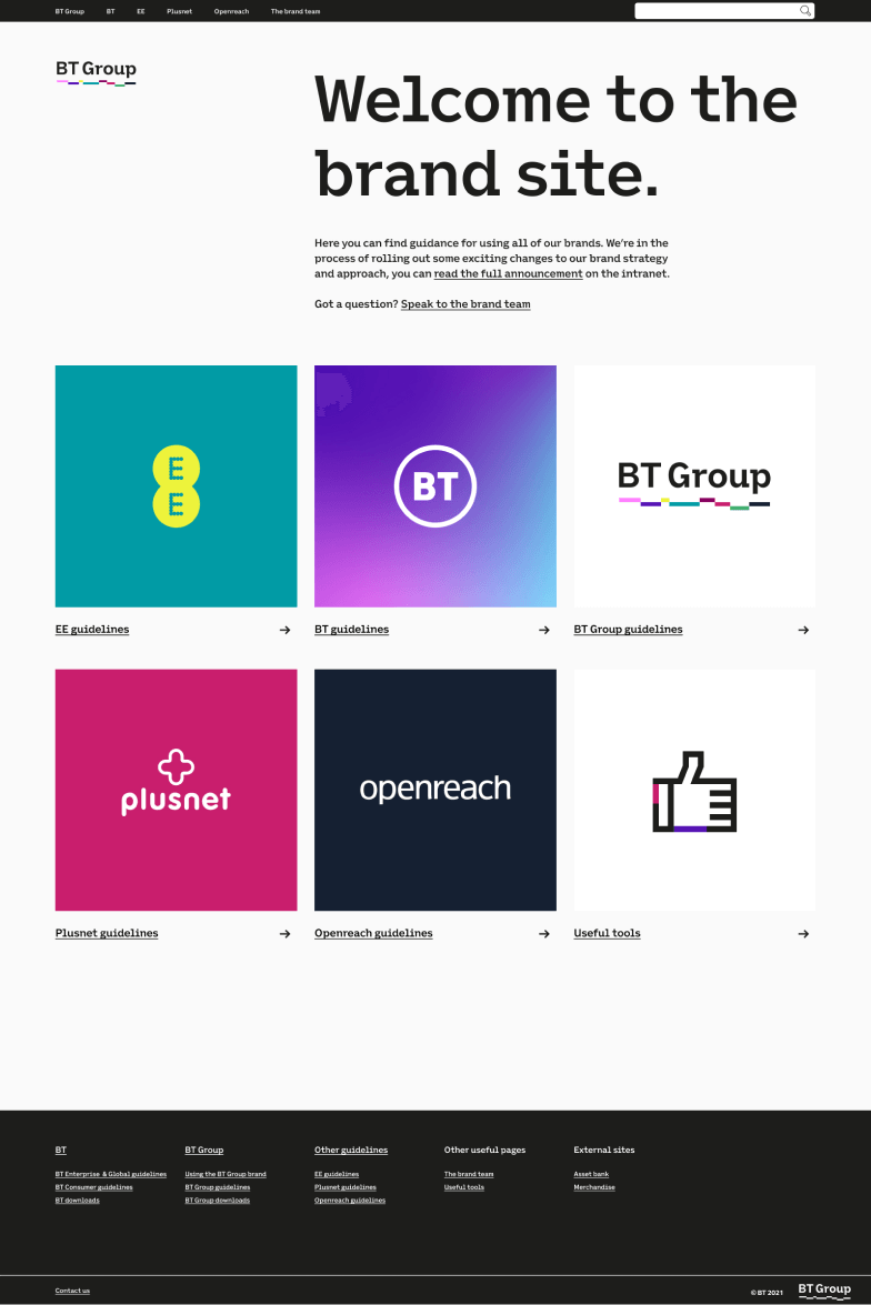
Site homepage
01.
Page to signpost to each brands section of the brand site. Hierarchy based on business importance of the brand.
02.
Reduced page height to make it quicker and easier to get to the brand you need.
03.
Background tweaked from white to very light grey following accessibly feedback. Photos replaced with logos to reduce cognitive load.
The dawn of a new era
The site transformed how the brand team was perceived. Teams now had confidence that they were working with the latest guidance. It wasn't just a website; it improved conversations and strengthened relationships with stakeholders. The site continues to adapt alongside the BT brands, growing with evolving guidelines and feedback from users. It's a never-ending journey.
