New EE
Refreshed. Re-energised. Rethought.
New EE was born with a vision of being the most personal customer-focused technology company in the UK. With those lofty ambitions came a new visual identity to help the brand grow and develop. A new and improved visual identity that takes the strengths of the brand consumers know and love and supercharges them.
Client
EE
Roles
Creative Direction
Creative Design
Brand Lead
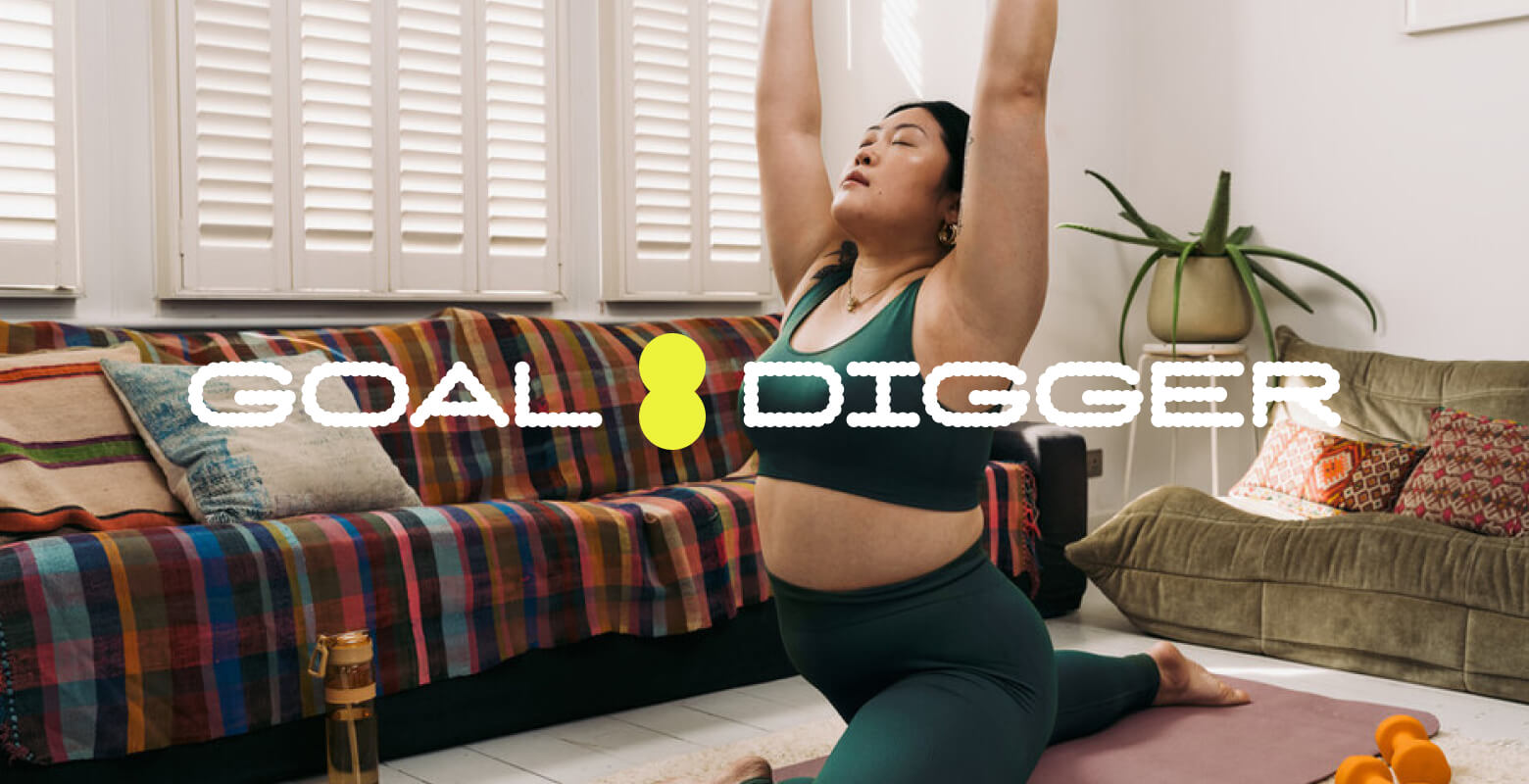
100% EE.
But not as
you know it.
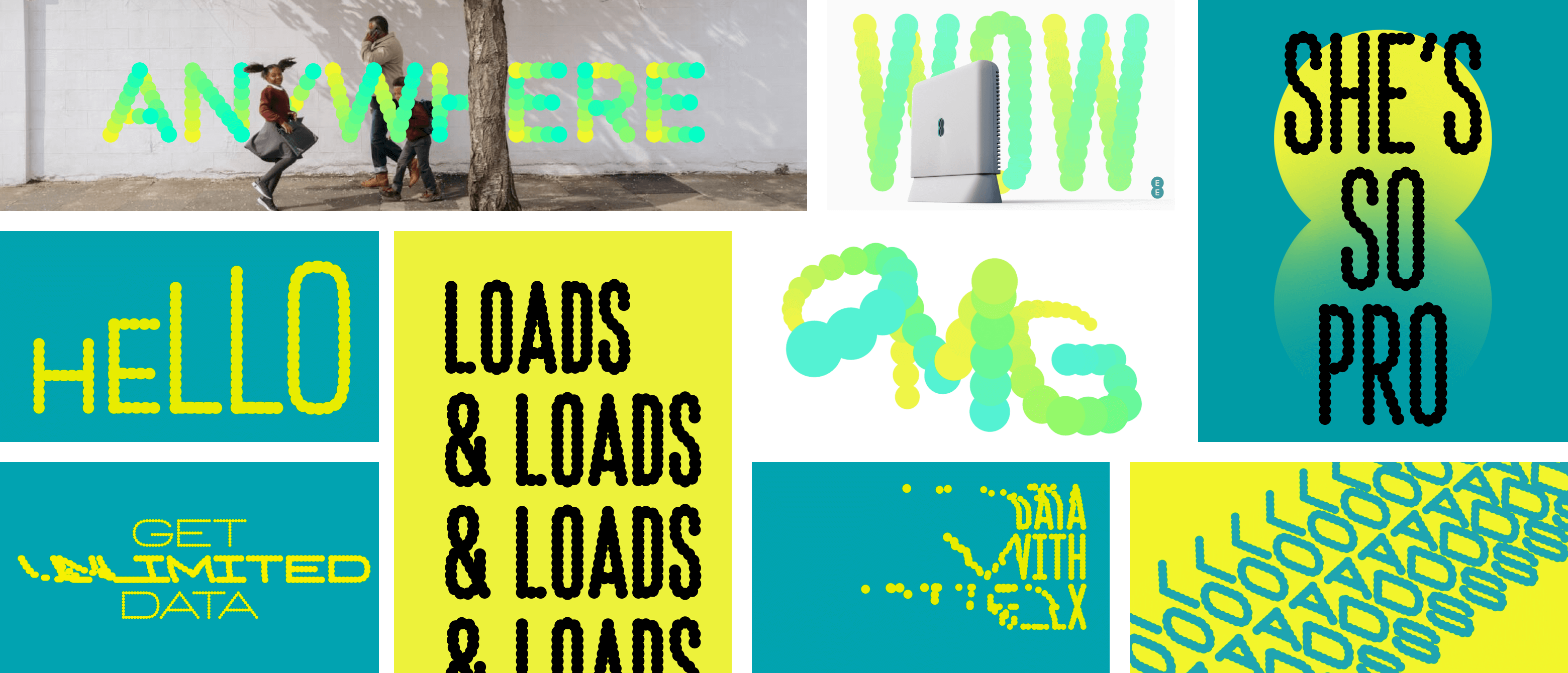
Despite feeling familiar everything was new. Leading with the smart dot, a small but powerful element brought to life across the brands assets. A new logo, hero asset (The Symbol), multiple typefaces, updated and expanded super-charged colour palette, illustrations, photography, motion, film, iconography, product renders, scent, haptics, UI language and digital behaviours. Together making the brand brighter and more energised.
Building a close working relationship with our brand agency Zag, I led on multiple aspects and was a key decision maker across the identity, assets and guidelines.
Logo
The classic EE logo was refined, built from Smart Dots with slightly adjusted "pinch points" where the dots are connected.
Colour
The aqua and yellow EE is famous for were supercharged, and a bright and light aqua were introduced. From these core colours I worked with the Design System team to create a 10 step colour palette to improve usability and accessibility in digital, while bringing consistency to digital products and experiences.


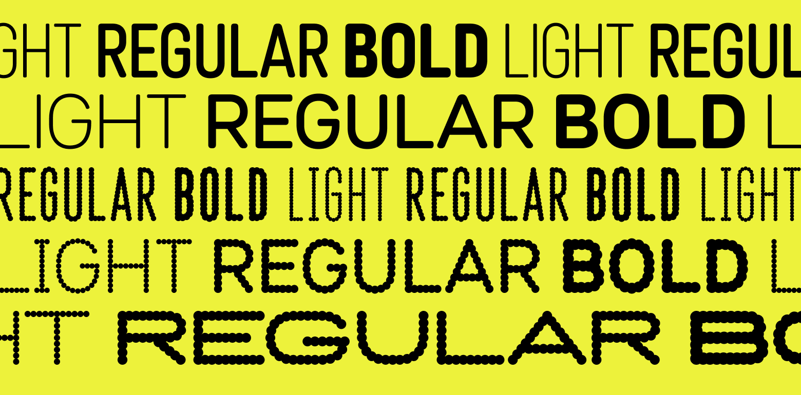
Typefaces
Zag and EE partnered with Colophon to create two new typefaces for the brand. I led from the EE side helping to craft and shape characters, weights and obliques. Ensuring legibility and accessibility was key to the designs. The result is two typefaces, Dottee and Non-Dottee, that work well as a team and are instantly recognisable.
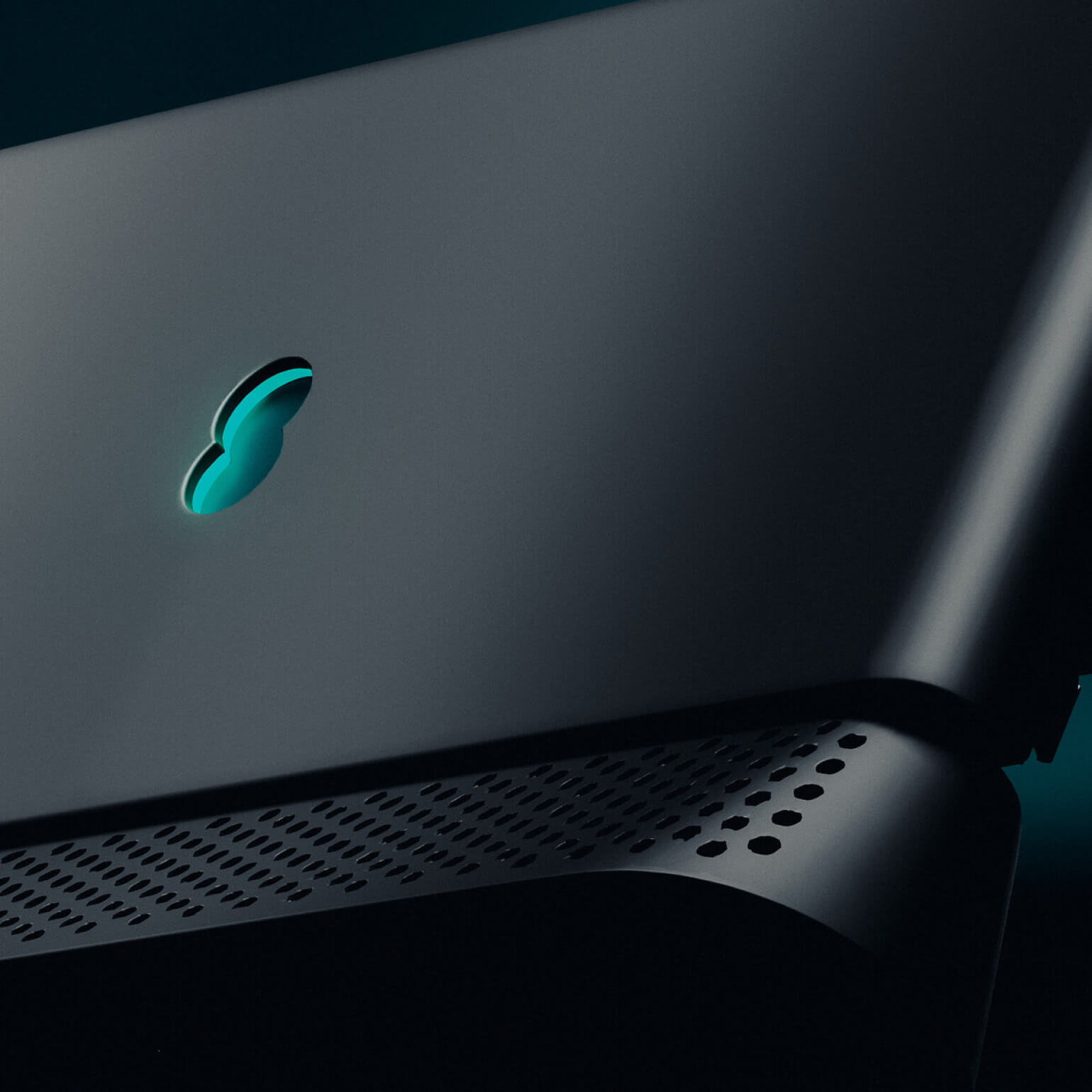
The symbol
A device to hero EE’s brilliant tools, products, and services. There are three different styles to give maximum flexibility across designs.
Illustrations
Illustration was introduced, allowing the brand to create engaging worlds and helping to explain the technology that EE provides. I was helped define and refine the look of the illustration styles and helped develop the guidance on when and where to use them, and how to create them.
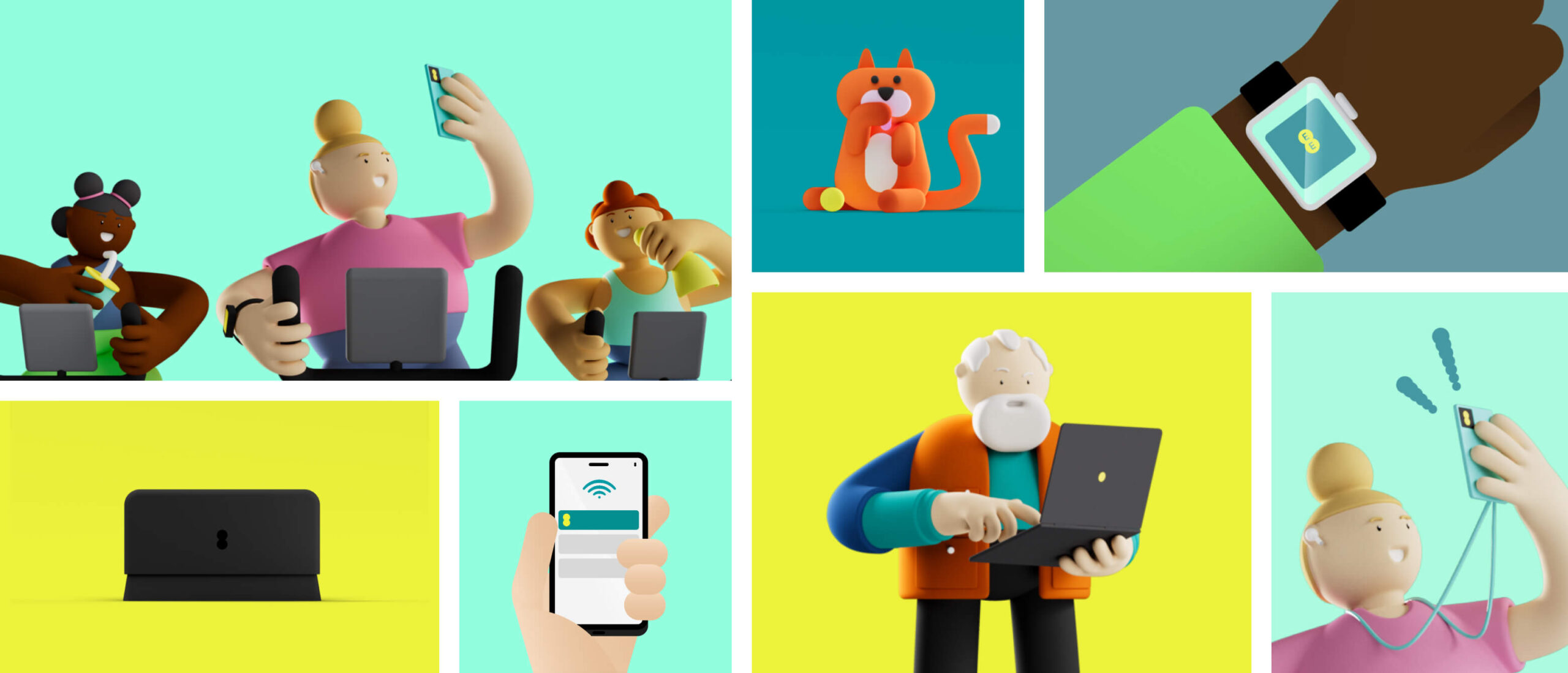
Iconography
I led the work to create a new set of icons for EE. The objective was to create icons that were clear to users while feeling part of the new brand. We developed filled versions for digital active states, which underwent user testing and adjustments as part of the broader UI work to ensure user-friendly integration.
Digital Vision
I spearheaded this project in collaboration with Zag and the EE digital team. The digital vision aimed to inspire internal teams, encouraging them to go beyond merely replacing the existing brand and instead, push the new brand. It served as a guiding "north star" to work towards.
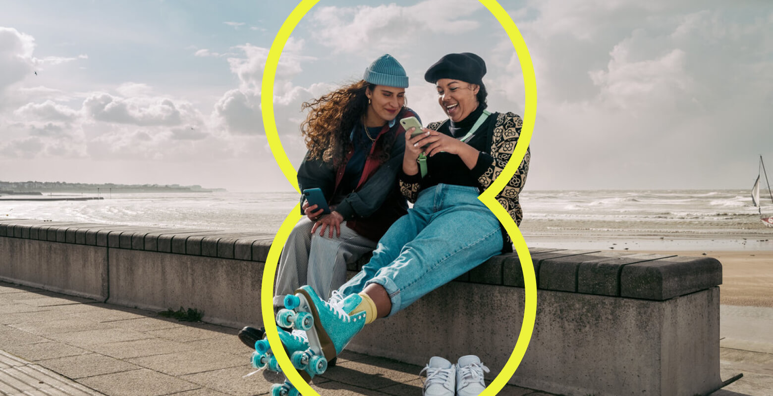
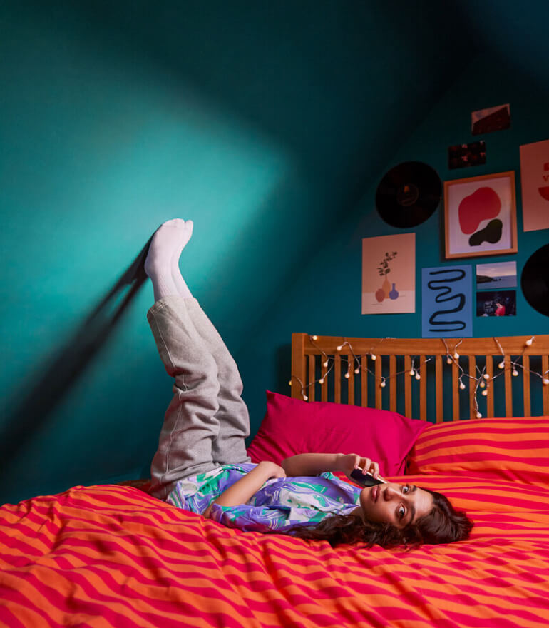
Photography
The photography was created to be a celebration of EE’s customers, showing a vibrant and authentic picture of the innovators of the UK.


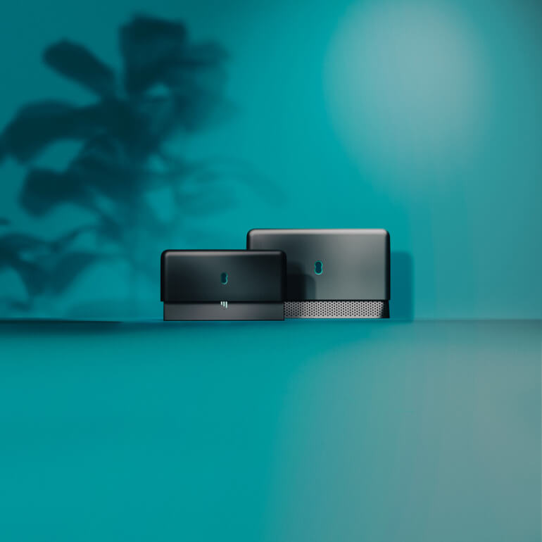
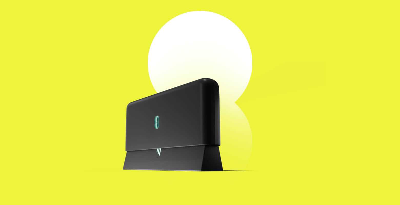
Devices
Devices were designed to be showcased in the most premium way possible, while maintaining a natural feel. Two versions were created, everyday and hero giving flexibly across execution and allowing EE to make devices the key part of any comms.