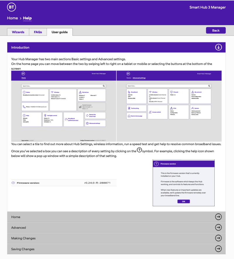
Smart Hub interface
As part of the BT rebrand I lead a digital ‘repaint’ project, overseeing the update and refresh of over 200 systems and sites to align them with the new brand. This comprehensive initiative included the redesign of the Smart Hub interface. The hub itself was being redesigned, using the new ‘device dna’, the interface also needed to reflect this bold new direction.
Client
BT Group
Roles
Lead Creative
UI Designer
Brand Lead
The brief
The Smart Hub should just plug-and-play, with users rarely having to encountering these screens. However, when users did interact with the interface, it needed to be easy to understand, user-friendly, and seamlessly integrated into the broader digital ecosystem. The initial brief emphasised applying the new brand to the existing interface—a quick fix, essentially a repaint. I was provided with screens from current hub, and it was evident they hadn’t seen much design attention in quite some time.
Screens of the previous current hub interface
Delivering more
Upon reviewing the current screens, it became clear that the interface would benefit from more substantial changes. While delivering designs that hit the initial brief, I also presented a 'what if' scenario—a concept that showcased how the interface could be significantly improved with a bit more time and attention. The team responsible for the hub interface responded positively to this alternative version. Subsequent conversations with the technical team led to iterations focused on simplifying and refining the designs further.
01.
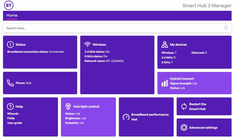
Repainted version of the hub home screen.
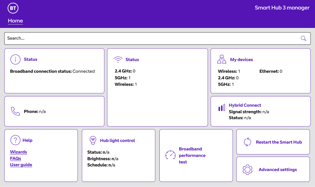
02.
The suggested, refreshed version.
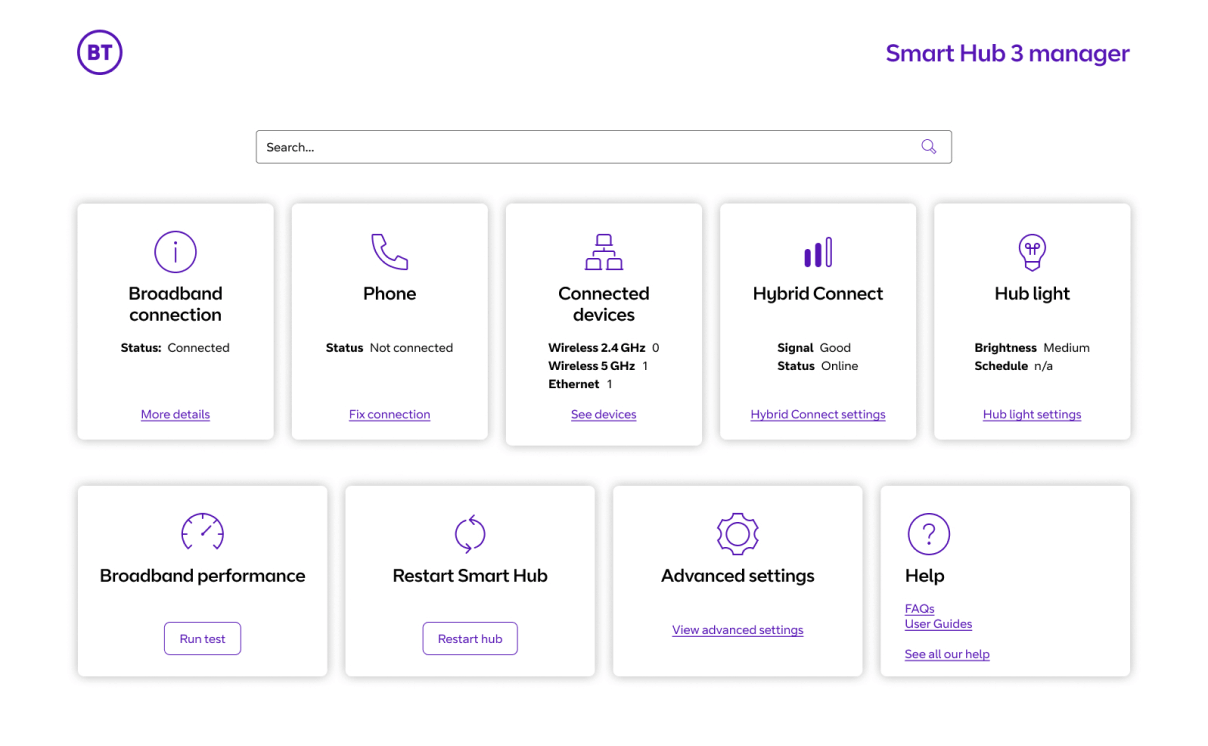
Iterations
01.
The suggested, refreshed version.
02.
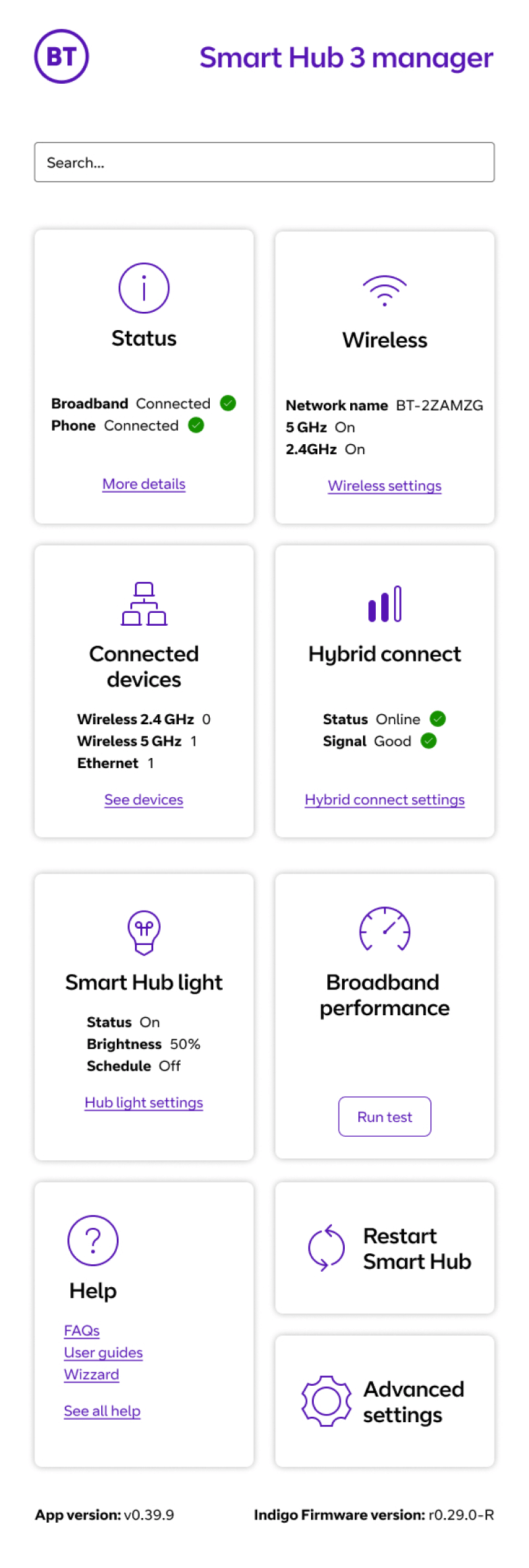
Iteration making the home screen simpler by grouping content and making actions different to cards.
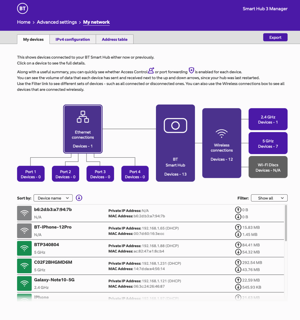
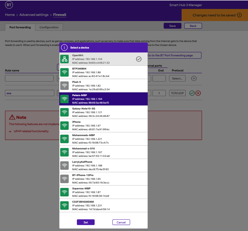
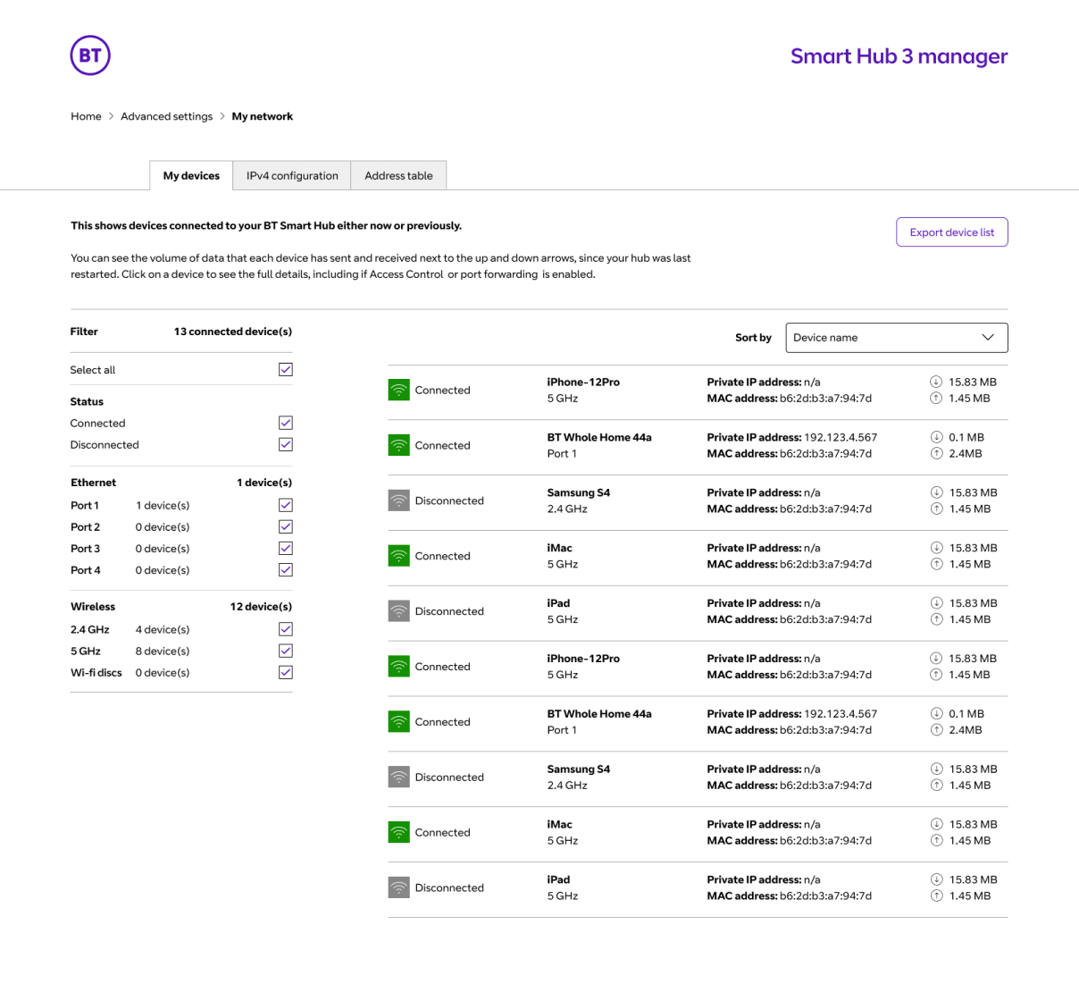
01.
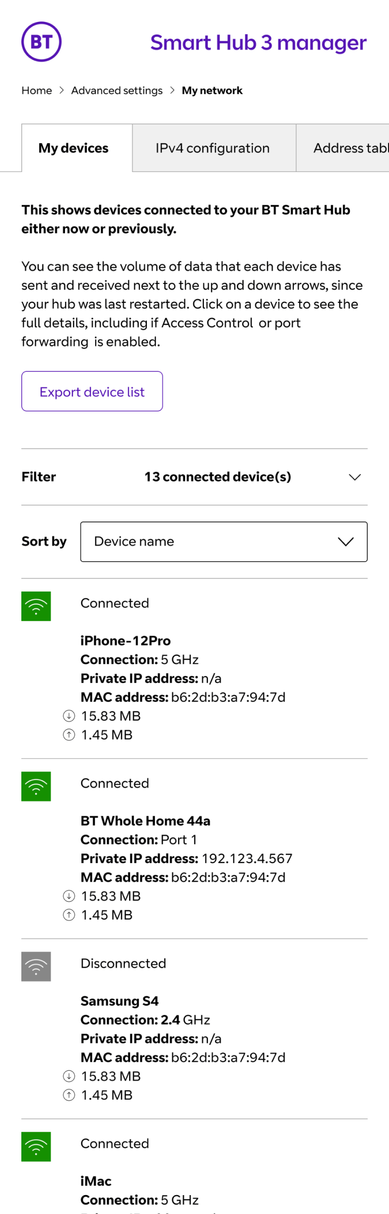
The provided ‘network’ page. The large purple cards filter the list of devices below in a rather un-obvious way.
02.
Updated design simplifying the list. Large interactive cards changed to a regular filter list, giving users a common pattern.
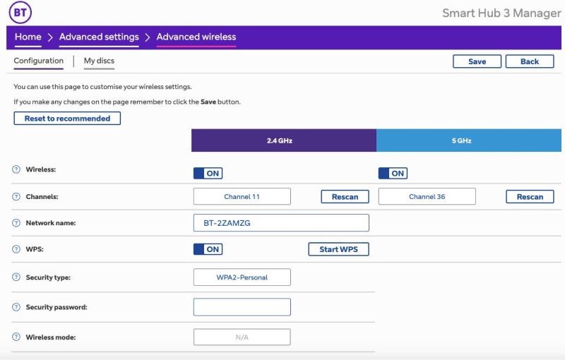
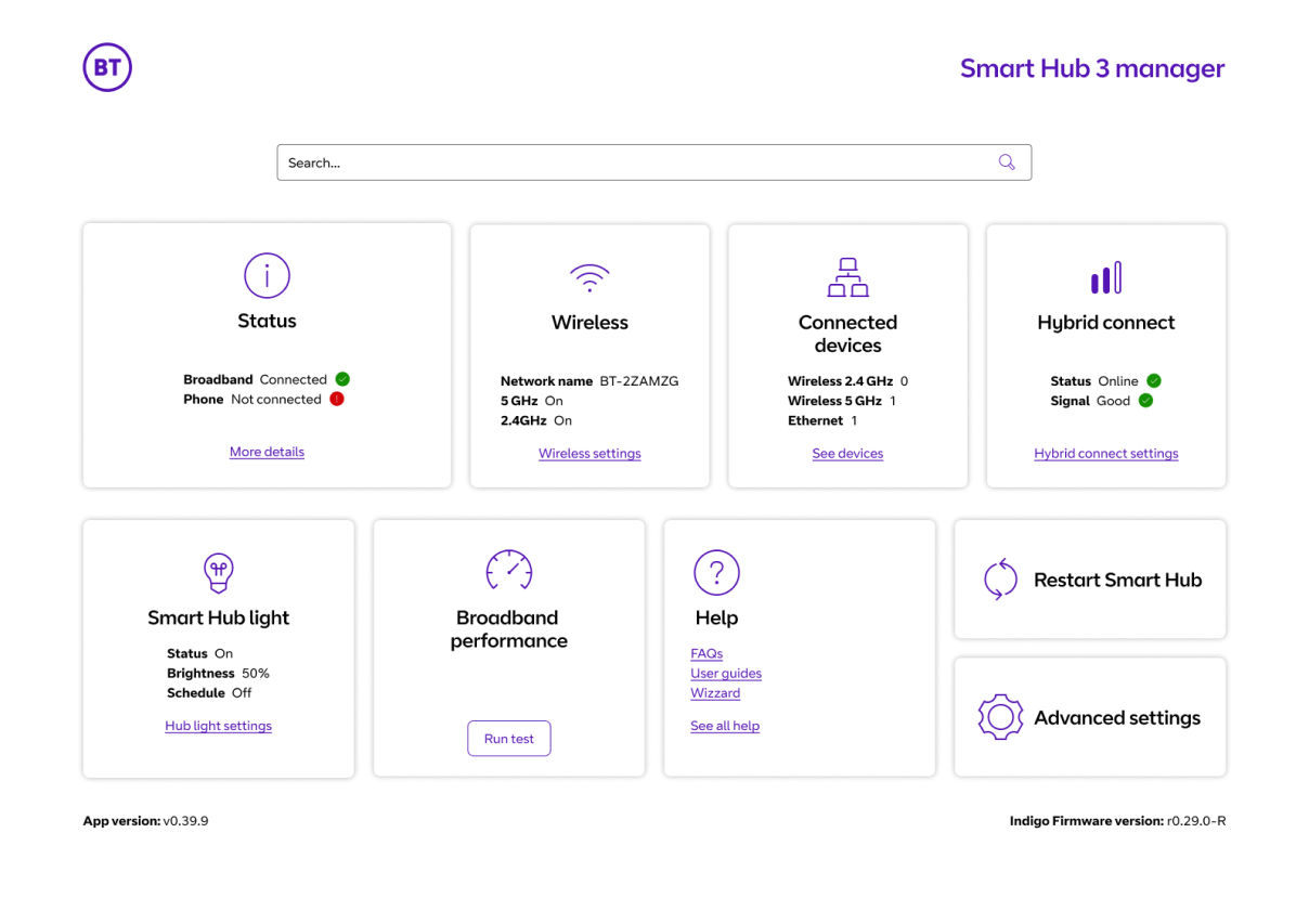
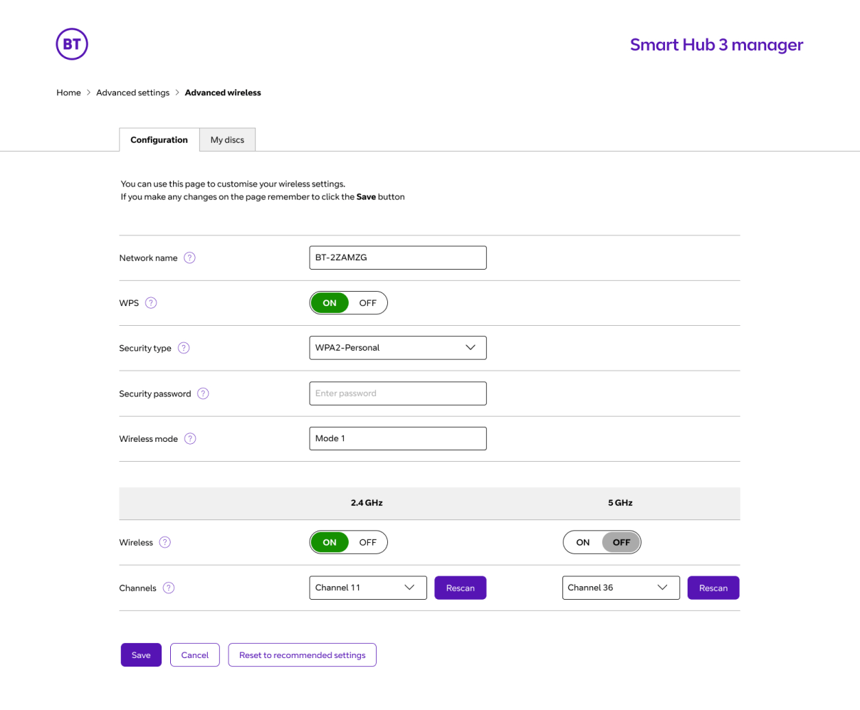
01.
The provided ‘advanced wireless’ page.
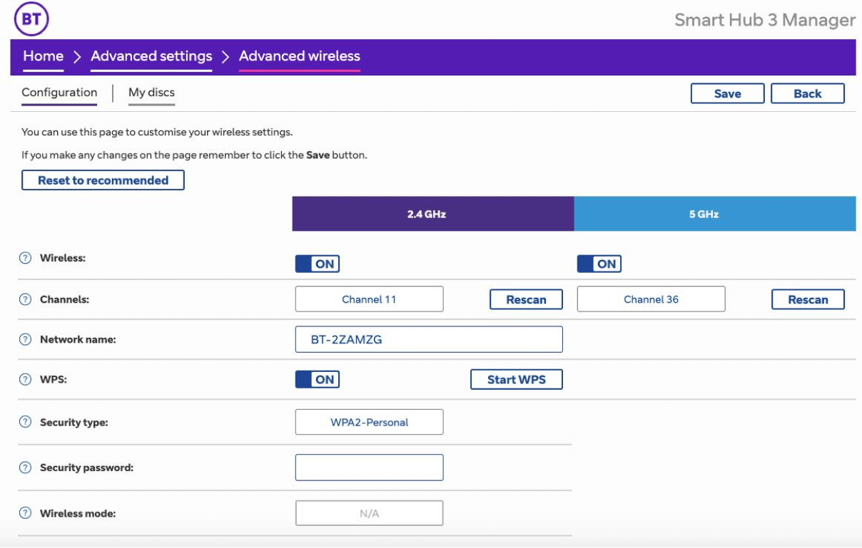
02.
Updated design adding clearer tabs. Clearer grouping for the sections that affect all the hub and those that are for specific frequencies.
A satisfying win
As a result of our collaborative efforts, the decision was made to launch the simplified design. This not only met the goals from the initial brief but also sparked an open dialogue within the team. With the potential for further refinement, we collectively agreed to continue the development of the designs through user feedback and insights into how people interacted with the interface. Giving the Smart Hub a forward-looking strategy and the ability to evolve with the digital landscape.