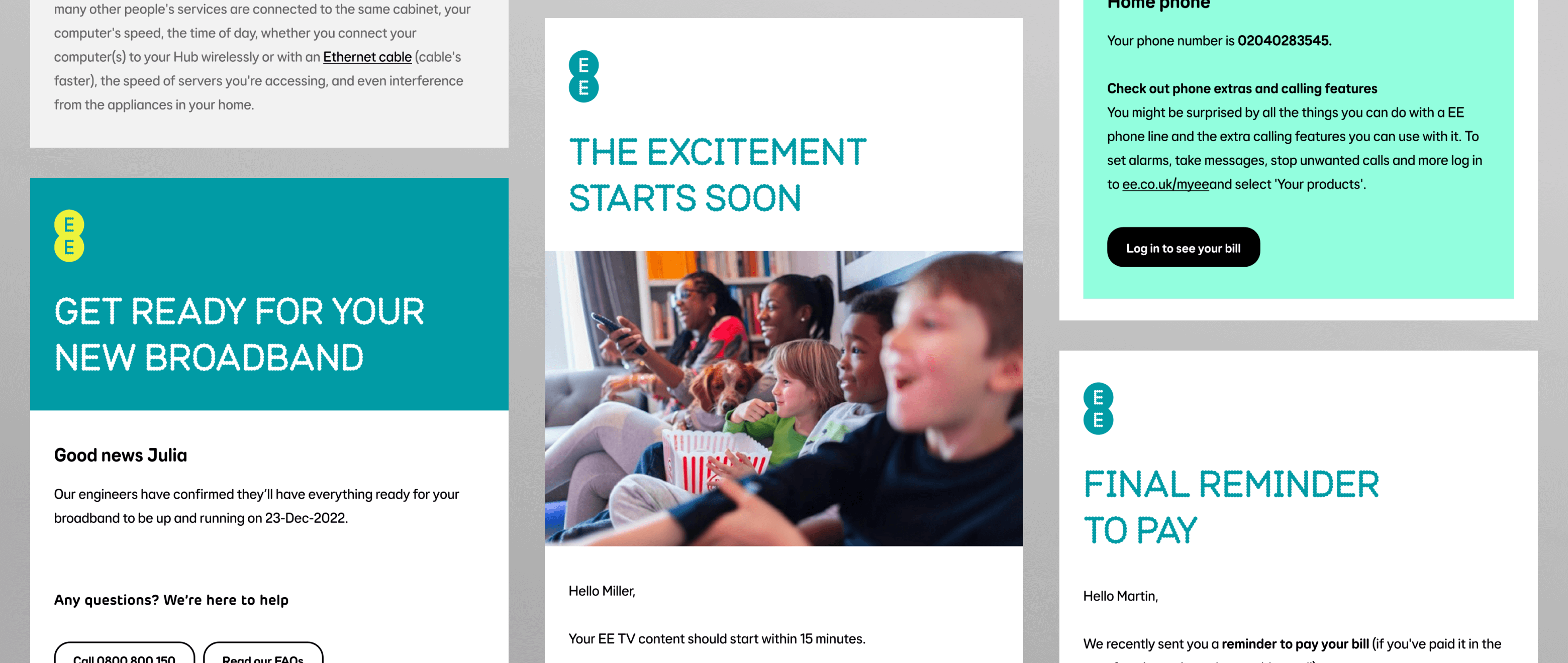
EE service emails
EE inundates users with a multitude of emails, ranging from order confirmations and dispatch notices following an initial purchase to reminders for in-life bill payments or updates on price changes. These emails haven’t always had consistent design, branding or content. With hundreds of variations depending on what you bought, when you bought it and what platform it was being sent from. The introduction of the new EE brand presented an opportunity to improve these key customer interactions.
Client
EE
Roles
Creative Direction
Creative Design
Brand Lead
Simplicity & consistency
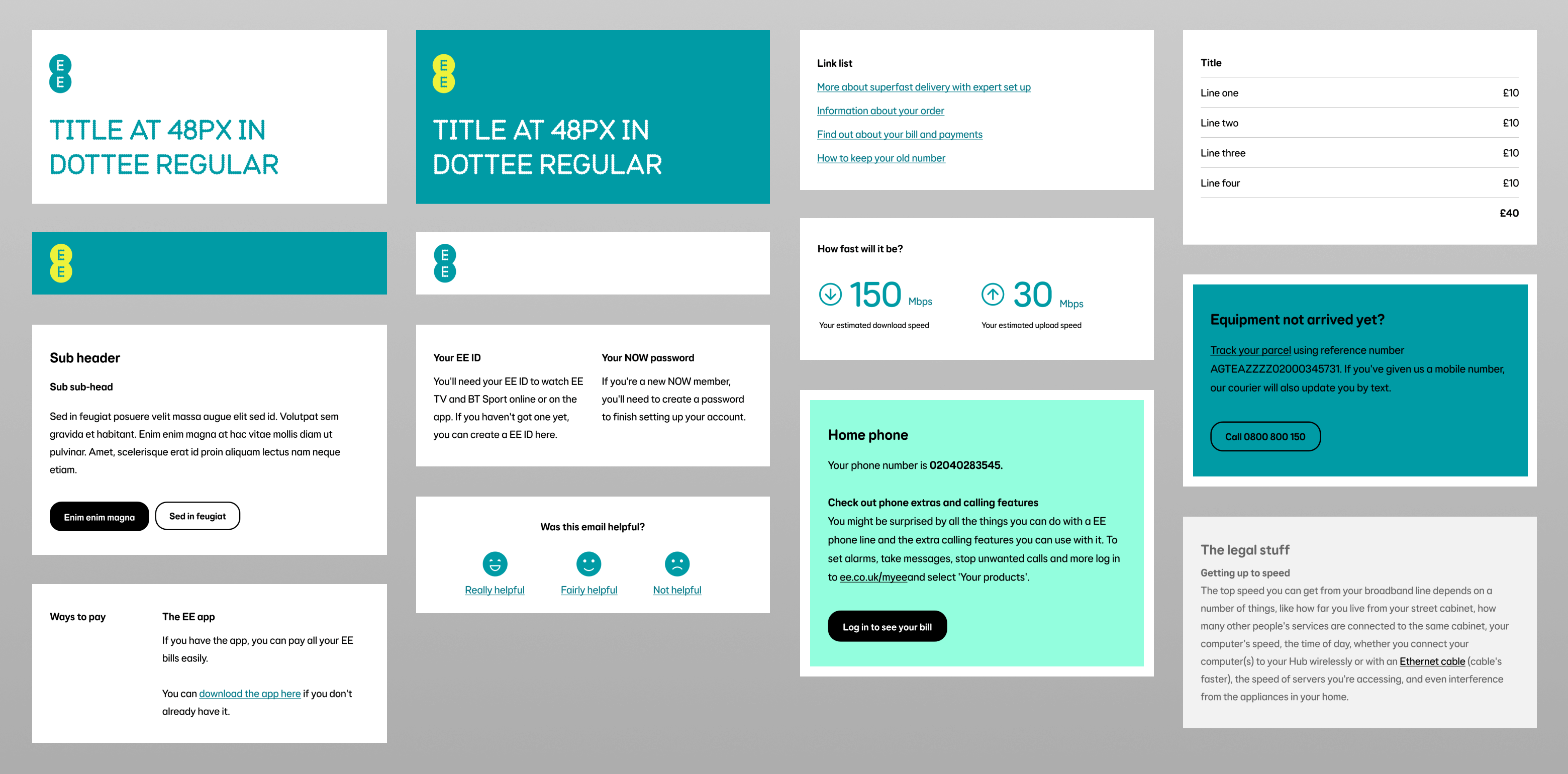
There were hundreds of templates spanning various platforms, but they shared some common elements. We started by identifying these elements and streamlining minor variations. Finding the balance between flexibility and complexity.
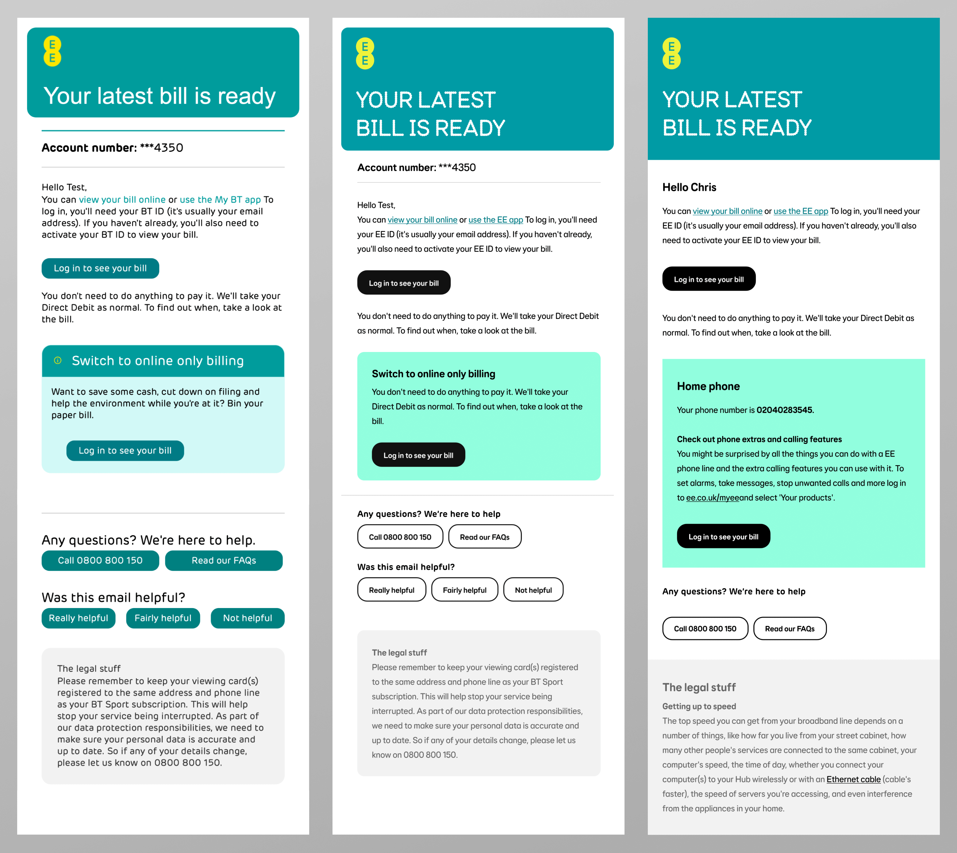
Once a core set of these components was established a handful of templates were picked that showcased them. These templates were designed, iterated, and aligned them with the new EE brand. And by incorporating the work happening elsewhere in digital introduced some much-needed consistency to the user experience.
Component designs
Design iterations
Refreshing Content
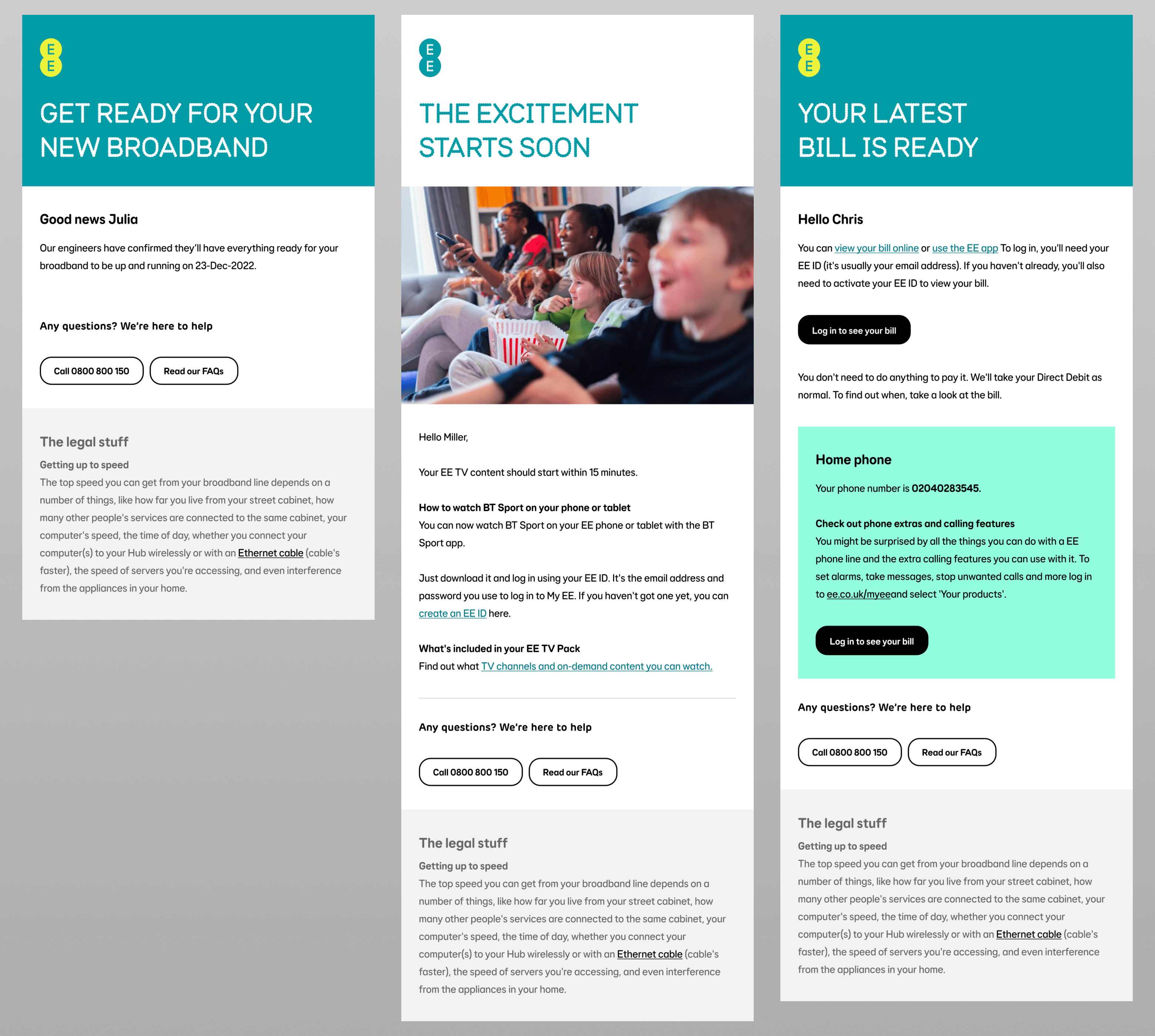
In addition to design improvements, the content within the emails underwent a thorough refresh. This included updated imagery, clearer diagrams, and a rewrite of the copy using the new tone of voice, making them clearer for customers.
Email designs
Looking to the future
Given the complexity of dealing with multiple platforms, the project couldn't address all issues at once. However, the changes brought some much-needed love to the emails, providing a solid foundation for future improvements. As legacy systems are gradually replaced with more functional ones, this solid foundation will keep improving customer emails.
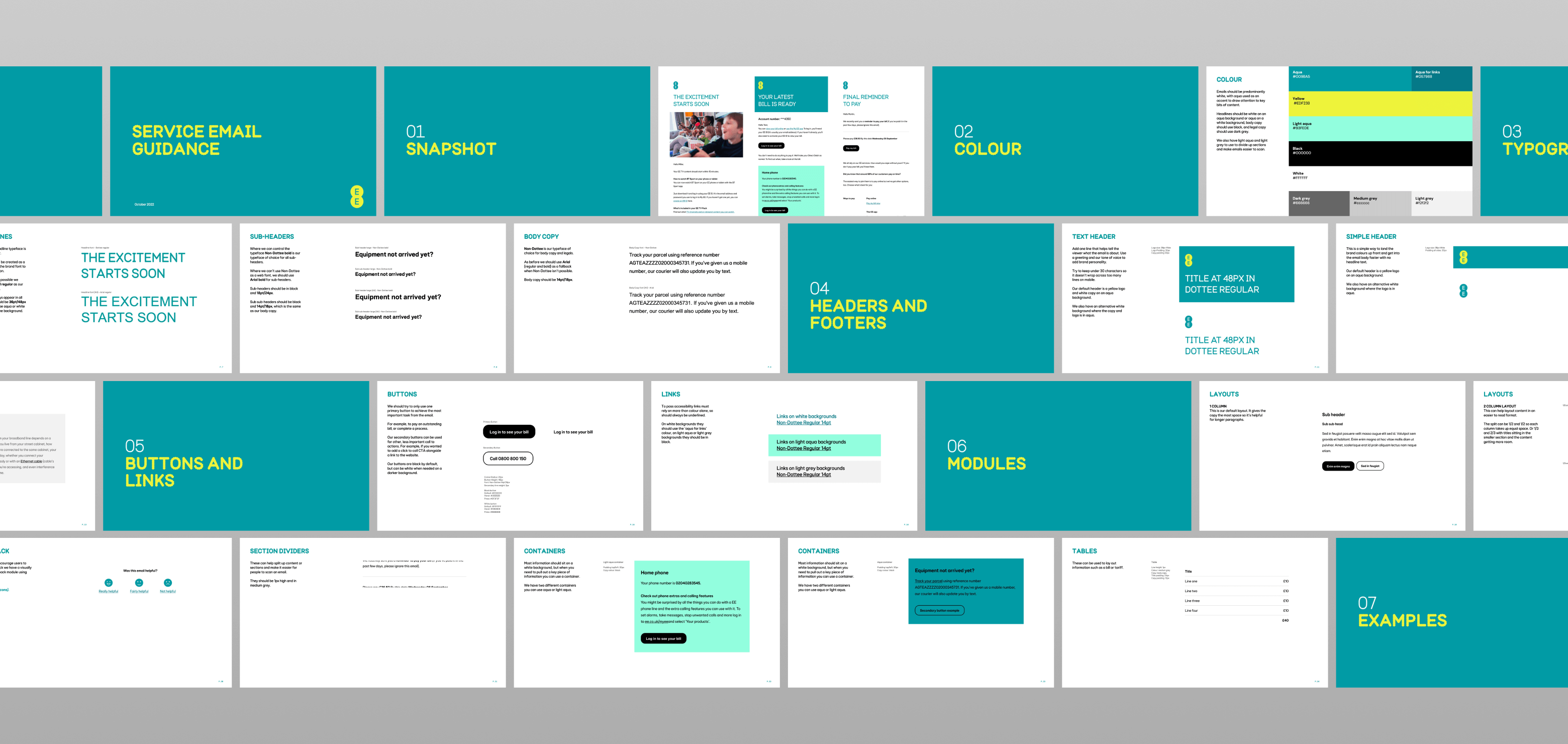
Guidelines